Każdy z szablonów można edytować i dowolnie dostosować do własnych potrzeb.
Na początek kilka uwag:
- Życzenia świąteczne należy wysyłać za pomocą mailingu w Sugesterze. Wtedy żaden z odbiorców nie zobaczy maili pozostałych adresatów (dla osób, które dopiero zaczynają przygodę z mailingiem polecamy wpis Wysyłanie e-mailingu z Sugestera).
- Należy zwrócić uwagę, z jakiej skrzynki nadawczej wysyłamy mailing.
- Firmowe logo i dane kontaktowe należy w szablonie uzupełnić ręcznie. Wewnątrz kodu HTML znajdują się wskazówki wpisane capslockiem
- W podglądzie szablonu będą widoczne zmienne zamiast niektórych danych np. {{company_name}}. To poprawne działanie. Przy wysyłce mailingu dane zostaną automatycznie pobrane do maila. Aby się upewnić, że mail będzie się poprawnie wyświetlał u odbiorcy, przed ostateczną wysyłką należy skorzystać z opcji "Testuj" w mailingu.
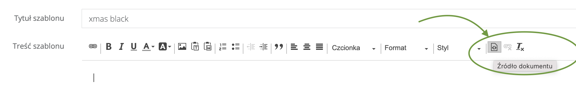
Aby skorzystać z wybranego szablonu należy skopiować podany pod szablonem kod HTML i wkleić w treść maila, podczas tworzenia mailingu. Żeby wkleić kod HTML należy w edytorze kliknąć ikonkę "Źródło dokumentu".
Przykłady szablonów maili świątecznych
1.
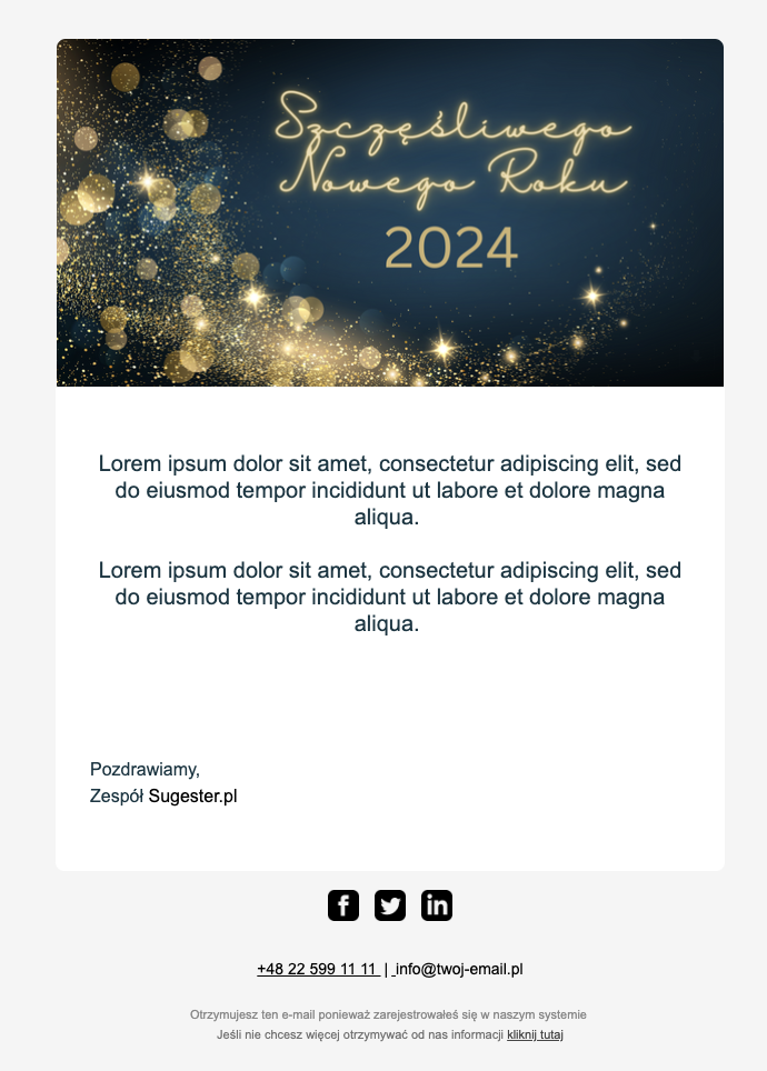
Kod HTML dla szablonu
<title></title>
<meta charset="UTF-8"><meta name="viewport" content="width=device-width,initial-scale=1">
<table style="
background: #f5f5f5;
border-radius: 30px;
width: 100%;
border-collapse: collapse;
border-spacing: 0;
">
<tbody>
<tr>
<td align="center"><img alt="" src="DODAJ SWOJE LOGO DO PLIKÓW W SUGESTERZE, A NATĘPNIE WKLEJ LINK DO LOGO TUTAJ" style="width: 186px; padding: 24px 0" /></td>
</tr>
<tr style="">
<td align="center" style="padding: 0">
<table role="presentation" style="
width: 100%;
max-width: 602px;
border-collapse: collapse;
border-spacing: 0;
text-align: left;
">
<tbody>
<tr style="box-shadow: 0 0 24px -12px gray">
<td align="center"><img alt="" src="https://files1.intum.net/s/sugester/files/32839/noworoczny-gold.png" style="
width: 100%;
border-radius: 8px 8px 0 0;
height: auto;
display: block;
" /></td>
</tr>
<tr style="
display: block;
border-radius: 0 0 8px 8px;
background-color: white;
box-shadow: 0 0 24px -12px gray;
">
<td style="padding: 36px 30px 42px 30px">
<table role="presentation" style="
width: 100%;
border-collapse: collapse;
border: 0;
border-spacing: 0;
">
<tbody>
<tr>
<td style="color: #153643">
<p style="margin: 0px 0px 12px; font-size: 20px; line-height: 24px; font-family: Arial; text-align: center;">Lorem ipsum dolor sit amet, consectetur adipiscing elit, sed do eiusmod tempor incididunt ut labore et dolore magna aliqua. <br />
<br />
Lorem ipsum dolor sit amet, consectetur adipiscing elit, sed do eiusmod tempor incididunt ut labore et dolore magna aliqua. </p>
<p style="
margin: 0 0 12px 0;
font-size: 16px;
line-height: 24px;
font-family: Arial;
"><br />
<br />
<br />
<br />
Pozdrawiamy,<br />
Zespół <a href="http://{{company_website}}" style="text-decoration:none;color: #000000" target="_blank">{{company_name}}</a></p>
</td>
</tr>
</tbody>
</table>
</td>
</tr>
<!--Footer-->
<tr>
<td style="padding: 16px">
<table role="presentation" style="
width: 100%;
border-collapse: collapse;
border: 0;
border-spacing: 0;
font-size: 9px;
font-family: Arial;
">
<tbody>
<tr>
<td align="center" style="padding: 0; width: 100%">
<table role="presentation" style="
border-collapse: collapse;
border: 0;
border-spacing: 0;
">
<tbody>
<tr>
<td><a href="TU WKLEJ LINK DO FIRMOWEGO FACEBOOKA" style="padding: 6px"><img alt="" src="https://files1.intum.net/r/radgost/files/32728/facebook-icon.png" style="height: 28px; width: 28px" /> </a></td>
<td><a href="TU WKLEJ LINK DO FIRMOWEGO TWITTERA" style="padding: 6px"><img alt="" src="https://files1.intum.net/r/radgost/files/32728/twitter-icon.png" style="height: 28px; width: 28px" /> </a></td>
<td><a href="TU WKLEJ LINK DO FIRMOWEGO LINKEDIN" style="padding: 6px"><img alt="" src="https://files1.intum.net/r/radgost/files/32728/linkedin-icon.png" style="height: 28px; width: 28px" /> </a></td>
</tr>
</tbody>
</table>
</td>
</tr>
<tr>
<td align="center" style="padding: 0; padding-top: 6px; width: 100%"> </td>
</tr>
<tr>
<td align="center" style="padding: 0; padding-top: 6px; width: 100%"><a href="tel:+48225994258" style="
color: black;
margin: 0 0 12px 0;
font-size: 14px;
line-height: 24px;
font-family: Arial;
">+48 22 599 11 11 <span style="padding: 0 3px">|</span> </a><a href="" style="
color: black;
margin: 0 0 12px 0;
font-size: 14px;
line-height: 24px;
font-family: Arial;
"> info@twoj-email.pl </a></td>
</tr>
<tr>
<td style="
text-align: center;
padding: 20px;
font-family: Arial;
font-size: 11px;
line-height: 18px;
color: #888888;
">Otrzymujesz ten e-mail ponieważ zarejestrowałeś się w naszym systemie <br />
<a href="TU WKLEJ ADRES SWOJEJ STRONY WWW" style="color: rgb(112, 112, 112); text-decoration: none" target="_blank">Jeśli nie chcesz więcej otrzymywać od nas informacji </a><a href="%5Bunsubscribe%5D" style="
color: #444444;
padding: 0;
text-decoration: underline;" target="_blank">kliknij tutaj </a></td>
</tr>
</tbody>
</table>
</td>
</tr>
</tbody>
</table>
</td>
</tr>
</tbody>
</table>
2.
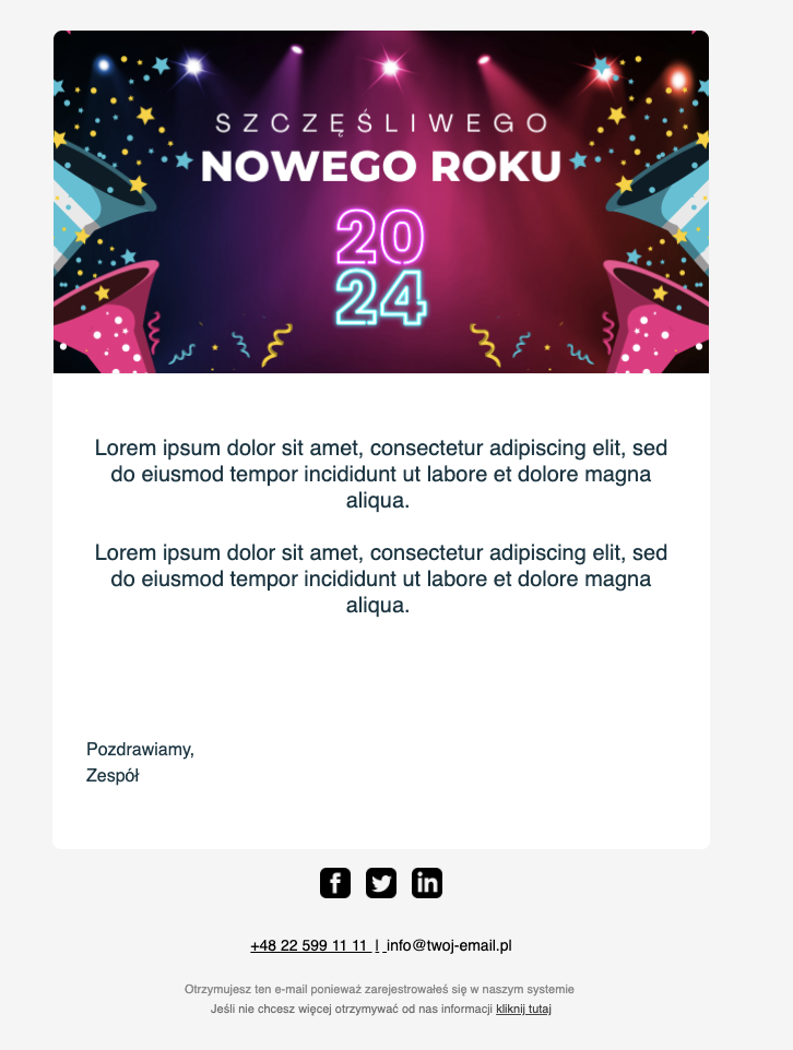
Kod HTML
<title></title>
<meta charset="UTF-8"><meta name="viewport" content="width=device-width,initial-scale=1">
<table style="
background: #f5f5f5;
border-radius: 30px;
width: 100%;
border-collapse: collapse;
border-spacing: 0;
">
<tbody>
<tr>
<td align="center"><img alt="" src="WKLEJ LOGO DO PLIKÓW W SUGESTERZE, A NASTĘPNIE TUTAJ WKLEJ LINK DO TEGO LOGO" style="width: 186px; padding: 24px 0" /></td>
</tr>
<tr style="">
<td align="center" style="padding: 0">
<table role="presentation" style="
width: 100%;
max-width: 602px;
border-collapse: collapse;
border-spacing: 0;
text-align: left;
">
<tbody>
<tr style="box-shadow: 0 0 24px -12px gray">
<td align="center"><img alt="" src="https://files1.intum.net/s/sugester/files/32839/noworoczny-%20purple.png" style="
width: 100%;
border-radius: 8px 8px 0 0;
height: auto;
display: block;
" /></td>
</tr>
<tr style="
display: block;
border-radius: 0 0 8px 8px;
background-color: white;
box-shadow: 0 0 24px -12px gray;
">
<td style="padding: 36px 30px 42px 30px">
<table role="presentation" style="
width: 100%;
border-collapse: collapse;
border: 0;
border-spacing: 0;
">
<tbody>
<tr>
<td style="color: #153643">
<p style="margin: 0px 0px 12px; font-size: 20px; line-height: 24px; font-family: Arial; text-align: center;">Lorem ipsum dolor sit amet, consectetur adipiscing elit, sed do eiusmod tempor incididunt ut labore et dolore magna aliqua. <br />
<br />
Lorem ipsum dolor sit amet, consectetur adipiscing elit, sed do eiusmod tempor incididunt ut labore et dolore magna aliqua. </p>
<p style="
margin: 0 0 12px 0;
font-size: 16px;
line-height: 24px;
font-family: Arial;
"><br />
<br />
<br />
<br />
Pozdrawiamy,<br />
Zespół <a href="http://{{company_website}}" style="text-decoration:none;color: #000000" target="_blank">{{company_name}}</a></p>
</td>
</tr>
</tbody>
</table>
</td>
</tr>
<!--Footer-->
<tr>
<td style="padding: 16px">
<table role="presentation" style="
width: 100%;
border-collapse: collapse;
border: 0;
border-spacing: 0;
font-size: 9px;
font-family: Arial;
">
<tbody>
<tr>
<td align="center" style="padding: 0; width: 100%">
<table role="presentation" style="
border-collapse: collapse;
border: 0;
border-spacing: 0;
">
<tbody>
<tr>
<td><a href="TU WKLEJ LINK DO FIRMOWEGO FACEBOOKA" style="padding: 6px"><img alt="" src="https://files1.intum.net/r/radgost/files/32728/facebook-icon.png" style="height: 28px; width: 28px" /> </a></td>
<td><a href="TU WKLEJ LINK DO FIRMOWEGO TWITTERA" style="padding: 6px"><img alt="" src="https://files1.intum.net/r/radgost/files/32728/twitter-icon.png" style="height: 28px; width: 28px" /> </a></td>
<td><a href="TU WKLEJ LINK DO FIRMOWEGO LINKEDIN" style="padding: 6px"><img alt="" src="https://files1.intum.net/r/radgost/files/32728/linkedin-icon.png" style="height: 28px; width: 28px" /> </a></td>
</tr>
</tbody>
</table>
</td>
</tr>
<tr>
<td align="center" style="padding: 0; padding-top: 6px; width: 100%"> </td>
</tr>
<tr>
<td align="center" style="padding: 0; padding-top: 6px; width: 100%"><a href="tel:+48225994258" style="
color: black;
margin: 0 0 12px 0;
font-size: 14px;
line-height: 24px;
font-family: Arial;
">+48 22 599 11 11 <span style="padding: 0 3px">|</span> </a><a href="" style="
color: black;
margin: 0 0 12px 0;
font-size: 14px;
line-height: 24px;
font-family: Arial;
"> info@twoj-email.pl </a></td>
</tr>
<tr>
<td style="
text-align: center;
padding: 20px;
font-family: Arial;
font-size: 11px;
line-height: 18px;
color: #888888;
">Otrzymujesz ten e-mail ponieważ zarejestrowałeś się w naszym systemie <br />
<a href="TU WKLEJ ADRES SWOJEJ STRONY WWW" style="color: rgb(112, 112, 112); text-decoration: none" target="_blank">Jeśli nie chcesz więcej otrzymywać od nas informacji </a><a href="%5Bunsubscribe%5D" style="
color: #444444;
padding: 0;
text-decoration: underline;
" target="_blank">kliknij tutaj </a></td>
</tr>
</tbody>
</table>
</td>
</tr>
</tbody>
</table>
</td>
</tr>
</tbody>
</table>
3.
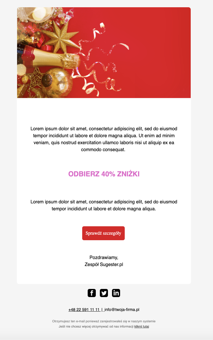
Kod HTML
<title></title>
<meta charset="UTF-8"><meta name="viewport" content="width=device-width,initial-scale=1">
<table style="
background: #f5f5f5;
border-radius: 30px;
width: 100%;
border-collapse: collapse;
border-spacing: 0;
">
<tbody>
<tr>
<td align="center"><img alt="" src="WKLEJ LOGO DO PLIKÓW W SUGESTERZE, A NASTĘPNIE LINK DO LOGO TUTAJ" style="width: 186px; padding: 24px 0" /></td>
</tr>
<tr style="">
<td align="center" style="padding: 0">
<table role="presentation" style="
width: 100%;
max-width: 602px;
border-collapse: collapse;
border-spacing: 0;
text-align: left;
">
<tbody>
<tr style="box-shadow: 0 0 24px -12px gray">
<td align="center"><img alt="" src="https://files1.intum.net/s/sugester/files/32839/noworoczny-red.png" style="
width: 100%;
border-radius: 8px 8px 0 0;
height: auto;
display: block;
" /></td>
</tr>
<tr style="
display: block;
border-radius: 0 0 8px 8px;
background-color: #ffffff;
box-shadow: 0 0 24px -12px gray;
">
<td style="padding: 36px 46px 42px 46px">
<table role="presentation" style="
width: 100%;
border-collapse: collapse;
border: 0;
border-spacing: 0;
">
<tbody>
<tr>
<td style="color: #000000; text-align: center;">
<h1 style="
text-align: left;
font-size: 24px;
margin: 0 0 20px 0;
font-family: Arial;
"> </h1>
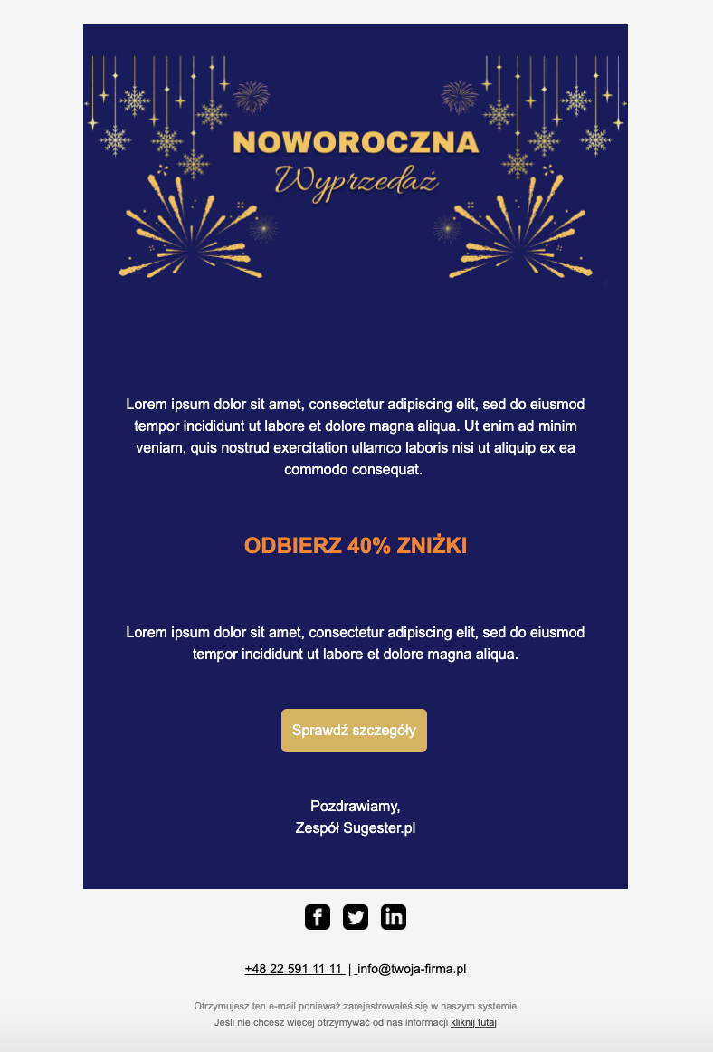
<p style="margin: 0px 0px 12px; font-size: 16px; line-height: 24px; font-family: Arial;">Lorem ipsum dolor sit amet, consectetur adipiscing elit, sed do eiusmod tempor incididunt ut labore et dolore magna aliqua. Ut enim ad minim veniam, quis nostrud exercitation ullamco laboris nisi ut aliquip ex ea commodo consequat. <br />
<br />
</p>
<p style="margin: 0px 0px 12px; font-size: 24px; color: #e861cc; line-height: 24px; font-family: Arial;"><strong>ODBIERZ 40% ZNIŻKI</strong><br />
</p>
<p style="
text-align: left;
margin: 0 0 12px 0;
font-size: 16px;
line-height: 24px;
font-family: Arial;
"> </p>
<p style="margin: 0px 0px 12px; font-size: 16px; line-height: 24px; font-family: Arial;">Lorem ipsum dolor sit amet, consectetur adipiscing elit, sed do eiusmod tempor incididunt ut labore et dolore magna aliqua.</p>
<p style="
text-align: left;
margin: 0 0 12px 0;
font-size: 16px;
line-height: 24px;
font-family: Arial;
"> </p>
<a href="https://NAZWA STRONY Z PROMOCJA" style="
background-color: #e2051c;
color: white;
margin: 0 auto;
text-align: center;
width: auto;
display: inline-block;
padding: 12px 0;
font-size: 16px;
border-radius: 6px;
text-decoration: none;
" target="_blank"><span style="
display: inline-block;
font-family: Inter, serif;
padding: 0 12px;
">Sprawdź szczegóły</span></a>
<p style="
margin: 0 0 12px 0;
font-size: 16px;
line-height: 24px;
font-family: Arial;
"><br />
<br />
Pozdrawiamy,<br />
Zespół <a href="http://{{company_website}}" style="text-decoration:none;color: #000000" target="_blank">{{company_name}}</a></p>
</td>
</tr>
</tbody>
</table>
</td>
</tr>
<!--Footer-->
<tr>
<td style="padding: 16px">
<table role="presentation" style="
width: 100%;
border-collapse: collapse;
border: 0;
border-spacing: 0;
font-size: 9px;
font-family: Arial;
">
<tbody>
<tr>
<td align="center" style="padding: 0; width: 100%">
<table role="presentation" style="
border-collapse: collapse;
border: 0;
border-spacing: 0;
">
<tbody>
<tr>
<td><a href="TU PODAJ LINK DO FIRMOWEGO FACEBOOKA" style="padding: 6px"><img alt="" src="https://files1.intum.net/r/radgost/files/32728/facebook-icon.png" style="height: 28px; width: 28px" /> </a></td>
<td><a href="TU PODAJ LINK DO FIRMOWEGO TWITTERA" style="padding: 6px"><img alt="" src="https://files1.intum.net/r/radgost/files/32728/twitter-icon.png" style="height: 28px; width: 28px" /> </a></td>
<td><a href="TU PODAJ LINK DO FIRMOWEGO LINKEDIN" style="padding: 6px"><img alt="" src="https://files1.intum.net/r/radgost/files/32728/linkedin-icon.png" style="height: 28px; width: 28px" /> </a></td>
</tr>
</tbody>
</table>
</td>
</tr>
<tr>
<td align="center" style="padding: 0; padding-top: 6px; width: 100%"> </td>
</tr>
<tr>
<td align="center" style="padding: 0; padding-top: 6px; width: 100%"><a href="tel:+48225994258" style="
color: black;
margin: 0 0 12px 0;
font-size: 14px;
line-height: 24px;
font-family: Arial;
">+48 22 591 11 11 <span style="padding: 0 3px">|</span> </a><a href="" style="
color: black;
margin: 0 0 12px 0;
font-size: 14px;
line-height: 24px;
font-family: Arial;
"> info@twoja-firma.pl </a></td>
</tr>
<tr>
<td style="
text-align: center;
padding: 20px;
font-family: Arial;
font-size: 11px;
line-height: 18px;
color: #888888;
">Otrzymujesz ten e-mail ponieważ zarejestrowałeś się w naszym systemie<br />
<a href="TU PODAJ LINK DO SWOJEJ STRONY WWW" style="color: rgb(112, 112, 112); text-decoration: none" target="_blank">Jeśli nie chcesz więcej otrzymywać od nas informacji </a><a href="%5Bunsubscribe%5D" style="
color: #444444;
padding: 0;
text-decoration: underline;
" target="_blank">kliknij tutaj </a></td>
</tr>
</tbody>
</table>
</td>
</tr>
</tbody>
</table>
</td>
</tr>
</tbody>
</table>
<meta charset="UTF-8"><meta name="viewport" content="width=device-width,initial-scale=1">
<table style="
background: #f5f5f5;
border-radius: 30px;
width: 100%;
border-collapse: collapse;
border-spacing: 0;
">
<tbody>
<tr>
<td align="center"><img alt="" src="WKLEJ LOGO DO PLIKÓW W SUGESTERZE, A NASTĘPNIE LINK DO LOGO TUTAJ" style="width: 186px; padding: 24px 0" /></td>
</tr>
<tr style="">
<td align="center" style="padding: 0">
<table role="presentation" style="
width: 100%;
max-width: 602px;
border-collapse: collapse;
border-spacing: 0;
text-align: left;
">
<tbody>
<tr style="box-shadow: 0 0 24px -12px gray">
<td align="center"><img alt="" src="https://files1.intum.net/s/sugester/files/32839/noworoczny-red.png" style="
width: 100%;
border-radius: 8px 8px 0 0;
height: auto;
display: block;
" /></td>
</tr>
<tr style="
display: block;
border-radius: 0 0 8px 8px;
background-color: #ffffff;
box-shadow: 0 0 24px -12px gray;
">
<td style="padding: 36px 46px 42px 46px">
<table role="presentation" style="
width: 100%;
border-collapse: collapse;
border: 0;
border-spacing: 0;
">
<tbody>
<tr>
<td style="color: #000000; text-align: center;">
<h1 style="
text-align: left;
font-size: 24px;
margin: 0 0 20px 0;
font-family: Arial;
"> </h1>
<p style="margin: 0px 0px 12px; font-size: 16px; line-height: 24px; font-family: Arial;">Lorem ipsum dolor sit amet, consectetur adipiscing elit, sed do eiusmod tempor incididunt ut labore et dolore magna aliqua. Ut enim ad minim veniam, quis nostrud exercitation ullamco laboris nisi ut aliquip ex ea commodo consequat. <br />
<br />
</p>
<p style="margin: 0px 0px 12px; font-size: 24px; color: #e861cc; line-height: 24px; font-family: Arial;"><strong>ODBIERZ 40% ZNIŻKI</strong><br />
</p>
<p style="
text-align: left;
margin: 0 0 12px 0;
font-size: 16px;
line-height: 24px;
font-family: Arial;
"> </p>
<p style="margin: 0px 0px 12px; font-size: 16px; line-height: 24px; font-family: Arial;">Lorem ipsum dolor sit amet, consectetur adipiscing elit, sed do eiusmod tempor incididunt ut labore et dolore magna aliqua.</p>
<p style="
text-align: left;
margin: 0 0 12px 0;
font-size: 16px;
line-height: 24px;
font-family: Arial;
"> </p>
<a href="https://NAZWA STRONY Z PROMOCJA" style="
background-color: #e2051c;
color: white;
margin: 0 auto;
text-align: center;
width: auto;
display: inline-block;
padding: 12px 0;
font-size: 16px;
border-radius: 6px;
text-decoration: none;
" target="_blank"><span style="
display: inline-block;
font-family: Inter, serif;
padding: 0 12px;
">Sprawdź szczegóły</span></a>
<p style="
margin: 0 0 12px 0;
font-size: 16px;
line-height: 24px;
font-family: Arial;
"><br />
<br />
Pozdrawiamy,<br />
Zespół <a href="http://{{company_website}}" style="text-decoration:none;color: #000000" target="_blank">{{company_name}}</a></p>
</td>
</tr>
</tbody>
</table>
</td>
</tr>
<!--Footer-->
<tr>
<td style="padding: 16px">
<table role="presentation" style="
width: 100%;
border-collapse: collapse;
border: 0;
border-spacing: 0;
font-size: 9px;
font-family: Arial;
">
<tbody>
<tr>
<td align="center" style="padding: 0; width: 100%">
<table role="presentation" style="
border-collapse: collapse;
border: 0;
border-spacing: 0;
">
<tbody>
<tr>
<td><a href="TU PODAJ LINK DO FIRMOWEGO FACEBOOKA" style="padding: 6px"><img alt="" src="https://files1.intum.net/r/radgost/files/32728/facebook-icon.png" style="height: 28px; width: 28px" /> </a></td>
<td><a href="TU PODAJ LINK DO FIRMOWEGO TWITTERA" style="padding: 6px"><img alt="" src="https://files1.intum.net/r/radgost/files/32728/twitter-icon.png" style="height: 28px; width: 28px" /> </a></td>
<td><a href="TU PODAJ LINK DO FIRMOWEGO LINKEDIN" style="padding: 6px"><img alt="" src="https://files1.intum.net/r/radgost/files/32728/linkedin-icon.png" style="height: 28px; width: 28px" /> </a></td>
</tr>
</tbody>
</table>
</td>
</tr>
<tr>
<td align="center" style="padding: 0; padding-top: 6px; width: 100%"> </td>
</tr>
<tr>
<td align="center" style="padding: 0; padding-top: 6px; width: 100%"><a href="tel:+48225994258" style="
color: black;
margin: 0 0 12px 0;
font-size: 14px;
line-height: 24px;
font-family: Arial;
">+48 22 591 11 11 <span style="padding: 0 3px">|</span> </a><a href="" style="
color: black;
margin: 0 0 12px 0;
font-size: 14px;
line-height: 24px;
font-family: Arial;
"> info@twoja-firma.pl </a></td>
</tr>
<tr>
<td style="
text-align: center;
padding: 20px;
font-family: Arial;
font-size: 11px;
line-height: 18px;
color: #888888;
">Otrzymujesz ten e-mail ponieważ zarejestrowałeś się w naszym systemie<br />
<a href="TU PODAJ LINK DO SWOJEJ STRONY WWW" style="color: rgb(112, 112, 112); text-decoration: none" target="_blank">Jeśli nie chcesz więcej otrzymywać od nas informacji </a><a href="%5Bunsubscribe%5D" style="
color: #444444;
padding: 0;
text-decoration: underline;
" target="_blank">kliknij tutaj </a></td>
</tr>
</tbody>
</table>
</td>
</tr>
</tbody>
</table>
</td>
</tr>
</tbody>
</table>
4. 
Kod HTML
<title></title>
<meta charset="UTF-8"><meta name="viewport" content="width=device-width,initial-scale=1">
<table style="
background: #f5f5f5;
border-radius: 30px;
width: 100%;
border-collapse: collapse;
border-spacing: 0;
">
<tbody>
<tr>
<td align="center"><img alt="" src="DODAJ LOGO DO PLIKÓW W SUGESTERZE, A NASTĘPNIE WKLEJ LINK DO LOGO TUTAJ" style="width: 186px; padding: 24px 0" /></td>
</tr>
<tr style="">
<td align="center" style="padding: 0">
<table role="presentation" style="
width: 100%;
max-width: 602px;
border-collapse: collapse;
border-spacing: 0;
text-align: left;
background-color: #1b185f;
">
<tbody>
<tr>
<td align="center"><img alt="" src="https://files1.intum.net/s/sugester/files/32839/noworoczny-navy.png" style="
width: 100%;
border-radius: 8px 8px 0 0;
height: auto;
display: block;
" /></td>
</tr>
<tr style="
display: block;
border-radius: 8px;
">
<td style="padding: 36px 46px 42px 46px; border-radius: 8px;">
<table role="presentation" style="
width: 100%;
border-collapse: collapse;
border: 0;
border-spacing: 0;
">
<tbody>
<tr>
<td style="color: #ffffff; text-align: center;">
<h1 style="
text-align: left;
font-size: 24px;
margin: 0 0 20px 0;
font-family: Arial;
"> </h1>
<p style="margin: 0px 0px 12px; font-size: 16px; line-height: 24px; font-family: Arial;">Lorem ipsum dolor sit amet, consectetur adipiscing elit, sed do eiusmod tempor incididunt ut labore et dolore magna aliqua. Ut enim ad minim veniam, quis nostrud exercitation ullamco laboris nisi ut aliquip ex ea commodo consequat. <br />
<br />
</p>
<p style="margin: 0px 0px 12px; font-size: 24px; color: #ff8000; line-height: 24px; font-family: Arial;"><strong>ODBIERZ 40% ZNIŻKI</strong><br />
</p>
<p style="
text-align: left;
margin: 0 0 12px 0;
font-size: 16px;
line-height: 24px;
font-family: Arial;
"> </p>
<p style="margin: 0px 0px 12px; font-size: 16px; color: #ffffff; line-height: 24px; font-family: Arial;">Lorem ipsum dolor sit amet, consectetur adipiscing elit, sed do eiusmod tempor incididunt ut labore et dolore magna aliqua.</p>
<p style="
text-align: left;
margin: 0 0 12px 0;
font-size: 16px;
line-height: 24px;
font-family: Arial;
"> </p>
<a href="https://NAZWA STRONY Z PROMOCJA" style="
background-color: #dcb254;
color: white;
margin: 0 auto;
text-align: center;
width: auto;
display: inline-block;
padding: 12px 0;
font-size: 16px;
border-radius: 6px;
text-decoration: none;
" target="_blank"><span style="
display: inline-block;
font-family: Arial, serif;
padding: 0 12px;
">Sprawdź szczegóły</span></a>
<p style="
margin: 0 0 12px 0;
font-size: 16px;
line-height: 24px;
font-family: Arial;
"><br />
<br />
Pozdrawiamy,<br />
Zespół <a href="http://{{company_website}}" style="text-decoration:none;color: #ffffff" target="_blank">{{company_name}}</a></p>
</td>
</tr>
</tbody>
</table>
</td>
</tr>
<!--Footer-->
<tr>
<td style="padding: 16px; background-color: #f5f5f5;">
<table role="presentation" style="
width: 100%;
border-collapse: collapse;
border: 0;
border-spacing: 0;
font-size: 9px;
font-family: Arial;
">
<tbody>
<tr>
<td align="center" style="padding: 0; width: 100%">
<table role="presentation" style="
border-collapse: collapse;
border: 0;
border-spacing: 0;
">
<tbody>
<tr>
<td><a href="TU PODAJ LINK DO FIRMOWEGO FACEBOOKA" style="padding: 6px"><img alt="" src="https://files1.intum.net/r/radgost/files/32728/facebook-icon.png" style="height: 28px; width: 28px" /> </a></td>
<td><a href="TU PODAJ LINK DO FIRMOWEGO TWITTERA" style="padding: 6px"><img alt="" src="https://files1.intum.net/r/radgost/files/32728/twitter-icon.png" style="height: 28px; width: 28px" /> </a></td>
<td><a href="TU PODAJ LINK DO FIRMOWEGO LINKEDIN" style="padding: 6px"><img alt="" src="https://files1.intum.net/r/radgost/files/32728/linkedin-icon.png" style="height: 28px; width: 28px" /> </a></td>
</tr>
</tbody>
</table>
</td>
</tr>
<tr>
<td align="center" style="padding: 0; padding-top: 6px; width: 100%"> </td>
</tr>
<tr>
<td align="center" style="padding: 0; padding-top: 6px; width: 100%"><a href="tel:+48225994258" style="
color: black;
margin: 0 0 12px 0;
font-size: 14px;
line-height: 24px;
font-family: Arial;
">+48 22 591 11 11 <span style="padding: 0 3px">|</span> </a><a href="" style="
color: black;
margin: 0 0 12px 0;
font-size: 14px;
line-height: 24px;
font-family: Arial;
"> info@twoja-firma.pl </a></td>
</tr>
<tr>
<td style="
text-align: center;
padding: 20px;
font-family: Arial;
font-size: 11px;
line-height: 18px;
color: #888888;
">Otrzymujesz ten e-mail ponieważ zarejestrowałeś się w naszym systemie<br />
<a href="TU PODAJ LINK DO SWOJEJ STRONY WWW" style="color: rgb(112, 112, 112); text-decoration: none" target="_blank">Jeśli nie chcesz więcej otrzymywać od nas informacji </a><a href="%5Bunsubscribe%5D" style="
color: #444444;
padding: 0;
text-decoration: underline;
" target="_blank">kliknij tutaj </a></td>
</tr>
</tbody>
</table>
</td>
</tr>
</tbody>
</table>
</td>
</tr>
</tbody>
</table>
apps-fileview.texmex_20231130.01_p1 mail-test.html Displaying mail-test.html.
5.
Kod HTML dla powyższego szablonu
<div id="sugester_footer_start"><br />
<!-- new new szablon --><meta http-equiv="Content-Type" content="text/html; charset=UTF-8"><meta name="viewport" content="initial-scale=1.0"><!-- So that mobile webkit will display zoomed in --><meta name="format-detection" content="telephone=no"><!-- disable auto telephone linking in iOS --></div>
<title></title>
<style type="text/css">a {
color: #236197;
text-decoration: none;
}
a:hover {
text-decoration: underline;
}
/* Force Hotmail to display emails at full width */
.ReadMsgBody {
width: 100%;
background-color: #eeeeee;
}
/* Force Hotmail to display emails at full width */
.ExternalClass {
width: 100%;
background-color: #eeeeee;
}
/* Forces Hotmail to display normal line spacing. */
.ExternalClass,
.ExternalClass p,
.ExternalClass span,
.ExternalClass font,
.ExternalClass td,
.ExternalClass div {
line-height:100%;
}
/* Resolves webkit padding issue. */
table {
border-spacing:0;
}
/* Resolves the Outlook 2007, 2010, and Gmail td padding issue. */
table td {
border-collapse:collapse;
}
/* Yahoo auto-sensing link color and border */
.yshortcuts a {
border-bottom: none !important;
}
h3 {
margin: 5px 0px 20px 0px; font-weight: normal; color: #236197; font-size: 17px;
}
.btn {
color: #000;
text-decoration: none;
display: inline-block;
padding: 9px 16px 8px 19px;
margin-bottom: 0;
text-align: center;
white-space: nowrap;
vertical-align: middle;
-ms-touch-action: manipulation;
touch-action: manipulation;
cursor: pointer;
-webkit-user-select: none;
-moz-user-select: none;
-ms-user-select: none;
user-select: none;
background-image: none;
border: 1px solid #184a76;
border-radius: 4px;
color: #fff;
background-color: #236197;
font-family: sans-serif;
font-size: 14px;
line-height: 2em;
margin-top:8px;
font-weight: 300;
}
.btn:hover,
.btn:focus {
color: #236197;
background-color: white;
border-color: #236197;
text-decoration: none;
}
h4 {margin-bottom: 0px;}
p {margin-top: 10px;}
span.more {
display: block;
clear: both;
margin-top: 10px;
}
span.no-break {
white-space: nowrap;
}
li {margin-left:10px;}
/* Media queries for when the viewport is smaller than the default email width but not too narrow. */
@media screen and (max-device-width: 650px), screen and (max-width: 650px) {
/* Constrain email width for small screens */
table[class="email-container"] {
width: 100% !important;
}
/* Constrain tables for small screens */
table[class="fluid"] {
width: 100% !important;
}
/* Force images to resize to full width of their container */
img[class="fluid"],
img[class="force-col-center"] {
width: 100% !important;
max-width: 100% !important;
height: auto !important;
}
/* And center these ones */
img[class="force-col-center"] {
margin: auto !important;
}
/* Force table cells into rows */
td[class="force-col"],
td[class="force-col-center"] {
display: block !important;
width: 100% !important;
clear: both;
}
/* And center these ones */
td[class="force-col-center"] {
text-align: center !important;
}
/* Force table cells into rows */
/* Float a previously stacked image to the left */
img[class="col-3-img-l"] {
float: left;
margin: 0 15px 15px 0;
}
/* Float a previously stacked image to the right */
img[class="col-3-img-r"] {
float: right;
margin: 0 0 15px 15px;
}
}
/* Media queries for when the viewport is narrow. */
/* Rules prefixed with 'hh-' (for 'handheld') repeat much of what's above, but these don't trigger until the smaller screen width. */
@media screen and (max-device-width: 425px), screen and (max-width: 425px) {
/* Helper only visible on handhelds. All styles are inline along with a `display:none`, which this class overrides */
div[class="hh-visible"] {
display: block !important;
}
/* Center stuff */
div[class="hh-center"] {
text-align: center;
width: 100% !important;
}
/* Constrain tables for small screens */
table[class="hh-fluid"] {
width: 100% !important;
}
/* Force images to resize to full width of their container */
img[class="hh-fluid"],
img[class="hh-force-col-center"] {
width: 100% !important;
max-width: 100% !important;
height: auto !important;
}
/* And center these ones */
img[class="hh-force-col-center"] {
margin: auto !important;
}
/* Force table cells into rows */
td[class="hh-force-col"],
td[class="hh-force-col-center"] {
display: block !important;
width: 100% !important;
clear: both;
}
/* And center these ones */
td[class="hh-force-col-center"] {
text-align: center !important;
}
/* Stack the previously floated images */
img[class="col-3-img-l"],
img[class="col-3-img-r"] {
float: none !important;
margin: 15px auto !important;
text-align: center !important;
}
table[class="button"] {
width: 100% !important;
text-align: center !important;
}
}
</style>
<table bgcolor="#f4f4f4" border="0" cellpadding="0" cellspacing="0" height="100%" style="background: #f4f4f4;" width="100%">
<tbody>
<tr>
<td><!-- CSS Image background in Outlook : BEGIN --><!-- Best used with absolute image paths --><!--[if gte mso 9]>
<v:background xmlns:v="urn:schemas-microsoft-com:vml" fill="t">
<v:fill type="tile" color="#eeeeee" src="assets/nice_snow.png">
</v:background>
<![endif]--><!-- CSS Image background in Outlook : END --><!-- Logo Left Nav Right + Vertical Padding : BEGIN -->
<table align="center" border="0" cellpadding="0" cellspacing="0" class="email-container" width="600">
<tbody>
<tr>
<td colspan="2" height="30" style="font-size: 0; line-height: 0;"> </td>
</tr>
<tr>
<td class="force-col-center" style="padding: 15px 0;text-align: center;" valign="center"><a href="http://{{company_website}}" style="border:0;display:block;margin:5px 20px 0 0;" target="_blank"><img alt="logo" src="TU WKLEJ LINK DO LOGA Z PLIKÓW W SUGESTERZE" /> </a></td>
</tr>
</tbody>
</table>
<!-- Logo Left Nav Right + Vertical Padding : END --><!-- Email Container : BEGIN --><!-- This table wraps the whole body email within it's width (600px), sets the background color (white) and border (thin, gray, solid) -->
<table align="center" border="0" cellpadding="0" cellspacing="0" class="email-container" style="background: #ffffff;border: 0;" width="600"><!-- Full Width, Fluid Column : BEGIN --><!-- Single Fluid Image, No Crop : BEGIN -->
<tbody>
<tr>
<td><a href="https://{{company_website}}"><img alt="" border="0" class="fluid" height="" src="https://files1.intum.net/s/sugesret2/files/Blue%20Minimalist%20Hello%20December%20Twitter%20Header.png" style="display: block;" width="600" /> </a></td>
</tr>
<!-- Single Fluid Image, No Crop : END -->
<tr>
<td>
<table align="center" border="0" cellpadding="0" cellspacing="0" width="100%">
<tbody>
<tr>
<td style="padding: 30px; font-family: sans-serif; font-size: 14px; line-height: 22px; color: #14142c; font-size:13px;">
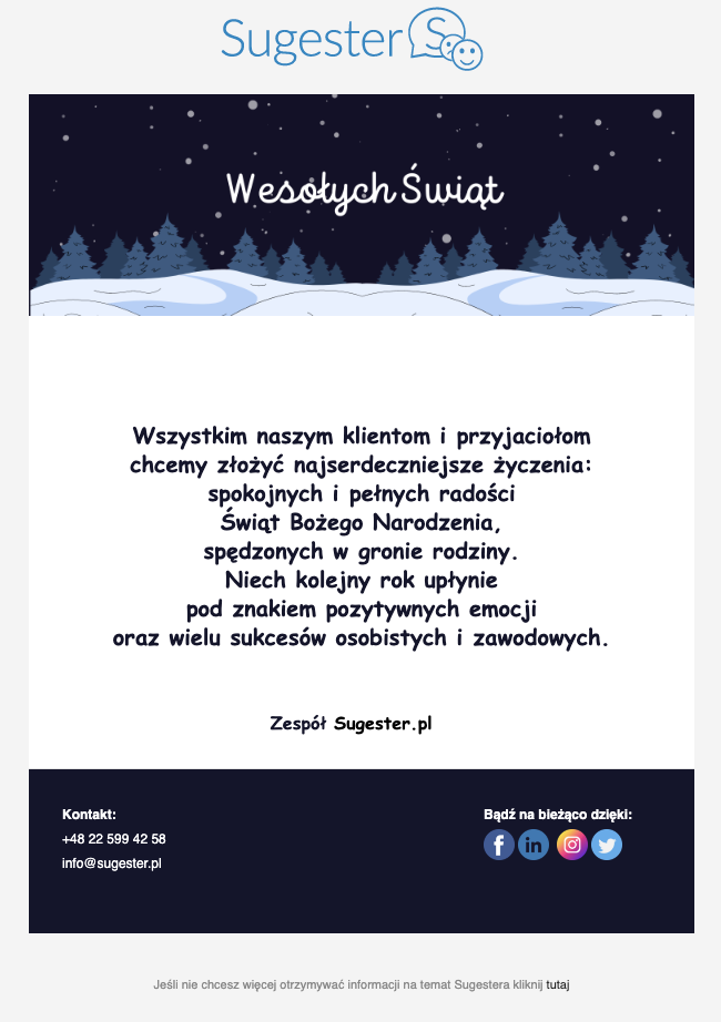
<div style="text-align: center;"><span style="font-family:Comic Sans MS,cursive; font-size: 20px;"><strong>Wszystkim naszym klientom i przyjaciołom<br />
chcemy złożyć najserdeczniejsze życzenia:<br />
spokojnych i pełnych radości<br />
Świąt Bożego Narodzenia,<br />
spędzonych w gronie rodziny.<br />
Niech kolejny rok upłynie<br />
pod znakiem pozytywnych emocji<br />
oraz wielu sukcesów osobistych i zawodowych.</strong></span></div>
</td>
</tr>
</tbody>
</table>
</td>
</tr>
<!-- Full Width, Fluid Column : END --><!-- Full Width, Fluid Column : BEGIN -->
<tr>
<td style="border-bottom: 1px solid #e5e5e5;">
<table align="center" border="0" cellpadding="0" cellspacing="0" width="100%">
<tbody>
<tr>
<td style="padding: 0px 30px 30px 30px; font-family: Comic Sans MS; font-size: 16px; line-height: 22px; color: #14142c;"><!-- Imageless Button : BEGIN --><!-- In Outlook, only the button label is clickable and nothing happens if you click the rest of the button shape. But it still works and code is simpler than the bulletproof button above. --><!-- Imageless Button : END -->
<div style="text-align: center;"><br />
<strong>Zespół <a href="http://{{company_website}}" style="text-decoration:none;color: #000" target="_blank">{{company_name}}</a> </strong> </div>
</td>
</tr>
</tbody>
</table>
</td>
</tr>
<!-- Full Width, Fluid Column : END --><!-- Three Column ==> Stacked Wide Layout ==> Stacked Narrow Layout : BEGIN -->
<tr>
<td style="padding: 30px;background-color:#14142c">
<table border="0" cellpadding="0" cellspacing="0" class="columns-container">
<tbody>
<tr>
<td class="force-col" style="padding-right: 30px;font-family: sans-serif; font-size: 12px; line-height: 22px;color: #ffffff;" valign="top" width="160"><strong>Kontakt:</strong><br />
<span class="mobile_link">TU WPISZ NUMER TEL</span><br />
<a href="TU WPISZ ADRES EMAIL" style="color:#ffffff;font-weight:normal;text-decoration:none" target="_blank">TU WPISZ ADRES EMAIL</a><br />
</td>
<td class="hh-spacer" style="font-size: 0; line-height: 0; display: none;"> </td>
<td class="force-col" style="padding-right: 30px;font-family: sans-serif; font-size: 12px; line-height: 22px;color: #ffffff;" valign="top" width="160"><br />
</td>
<td class="hh-spacer" style="font-size: 0; line-height: 0; display: none;"> </td>
<td class="force-col" style="font-family: sans-serif; font-size: 12px; line-height: 22px;color: #ffffff;" valign="top" width="160"><strong style="display:block;margin-bottom:2px">Bądź na bieżąco dzięki:</strong> <a href="http://{{company_facebook}}" style="border:0;text-decoration:none" target="_blank"> <img alt="facebook" src="https://files1.intum.net/s/sugesret2/files/facebook%20%282%29%20%281%29.png" style="border:0;width:28px" /> </a> <a href="http://{{company_linkedin}}" style="border:0;text-decoration:none" target="_blank"> <img alt="linkedin" src="https://files1.intum.net/s/sugesret2/files/linkedin%20%284%29%20%281%29.png" style="border:0;width:28px" /> </a> <a href="http://{{company_instagram}}" style="border:0;text-decoration:none" target="_blank"> <img alt="instagaram" src="https://files1.intum.net/s/sugesret2/files/instagram%20%282%29%20%281%29.png" style="border:0;width:28px" /> </a> <a href="http://{{company_twitter}}" style="border:0;text-decoration:none" target="_blank"> <img alt="twitter" src="https://files1.intum.net/s/sugesret2/files/twitter%20%281%29.png" style="border:0;width:28px" /> </a></td>
</tr>
</tbody>
</table>
</td>
</tr>
<!-- Three Column ==> Stacked Wide Layout ==> Stacked Narrow Layout : END -->
</tbody>
</table>
<!-- Email Container : END --><!-- Footer : BEGIN -->
<table align="center" border="0" cellpadding="0" cellspacing="0" class="email-container" width="100%">
<tbody>
<tr>
<td style="text-align: center;padding: 20px;font-family: sans-serif; font-size: 11px; line-height: 18px;color: #888888;"><br />
Jeśli nie chcesz więcej otrzymywać od nas podobnych informacji kliknij <a href="[[unsubscribe_url]]">tutaj</a><br />
<br />
</td>
</tr>
</tbody>
</table>
<!-- Footer : END --></td>
</tr>
</tbody>
</table>
<!-- end of new new szablon -->
<div id="sugester_footer_end"> </div>
<div id="sugester_efooter_start"><br />
<br />
<br />
</div>
<div id="sugester_efooter_end"> </div>
6.
Kod HTML do powyższego szablonu
<div id="sugester_footer_start"><br />
<!-- new new szablon --><meta http-equiv="Content-Type" content="text/html; charset=UTF-8"><meta name="viewport" content="initial-scale=1.0"><!-- So that mobile webkit will display zoomed in --><meta name="format-detection" content="telephone=no"><!-- disable auto telephone linking in iOS --></div>
<title></title>
<style type="text/css">a {
color: #236197;
text-decoration: none;
}
a:hover {
text-decoration: underline;
}
/* Force Hotmail to display emails at full width */
.ReadMsgBody {
width: 100%;
background-color: #eeeeee;
}
/* Force Hotmail to display emails at full width */
.ExternalClass {
width: 100%;
background-color: #eeeeee;
}
/* Forces Hotmail to display normal line spacing. */
.ExternalClass,
.ExternalClass p,
.ExternalClass span,
.ExternalClass font,
.ExternalClass td,
.ExternalClass div {
line-height:100%;
}
/* Resolves webkit padding issue. */
table {
border-spacing:0;
}
/* Resolves the Outlook 2007, 2010, and Gmail td padding issue. */
table td {
border-collapse:collapse;
}
/* Yahoo auto-sensing link color and border */
.yshortcuts a {
border-bottom: none !important;
}
h3 {
margin: 5px 0px 20px 0px; font-weight: normal; color: #236197; font-size: 17px;
}
.btn {
color: #000;
text-decoration: none;
display: inline-block;
padding: 9px 16px 8px 19px;
margin-bottom: 0;
text-align: center;
white-space: nowrap;
vertical-align: middle;
-ms-touch-action: manipulation;
touch-action: manipulation;
cursor: pointer;
-webkit-user-select: none;
-moz-user-select: none;
-ms-user-select: none;
user-select: none;
background-image: none;
border: 1px solid #184a76;
border-radius: 4px;
color: #fff;
background-color: #236197;
font-family: sans-serif;
font-size: 14px;
line-height: 2em;
margin-top:8px;
font-weight: 300;
}
.btn:hover,
.btn:focus {
color: #236197;
background-color: white;
border-color: #236197;
text-decoration: none;
}
h4 {margin-bottom: 0px;}
p {margin-top: 10px;}
span.more {
display: block;
clear: both;
margin-top: 10px;
}
span.no-break {
white-space: nowrap;
}
li {margin-left:10px;}
/* Media queries for when the viewport is smaller than the default email width but not too narrow. */
@media screen and (max-device-width: 650px), screen and (max-width: 650px) {
/* Constrain email width for small screens */
table[class="email-container"] {
width: 100% !important;
}
/* Constrain tables for small screens */
table[class="fluid"] {
width: 100% !important;
}
/* Force images to resize to full width of their container */
img[class="fluid"],
img[class="force-col-center"] {
width: 100% !important;
max-width: 100% !important;
height: auto !important;
}
/* And center these ones */
img[class="force-col-center"] {
margin: auto !important;
}
/* Force table cells into rows */
td[class="force-col"],
td[class="force-col-center"] {
display: block !important;
width: 100% !important;
clear: both;
}
/* And center these ones */
td[class="force-col-center"] {
text-align: center !important;
}
/* Force table cells into rows */
/* Float a previously stacked image to the left */
img[class="col-3-img-l"] {
float: left;
margin: 0 15px 15px 0;
}
/* Float a previously stacked image to the right */
img[class="col-3-img-r"] {
float: right;
margin: 0 0 15px 15px;
}
}
/* Media queries for when the viewport is narrow. */
/* Rules prefixed with 'hh-' (for 'handheld') repeat much of what's above, but these don't trigger until the smaller screen width. */
@media screen and (max-device-width: 425px), screen and (max-width: 425px) {
/* Helper only visible on handhelds. All styles are inline along with a `display:none`, which this class overrides */
div[class="hh-visible"] {
display: block !important;
}
/* Center stuff */
div[class="hh-center"] {
text-align: center;
width: 100% !important;
}
/* Constrain tables for small screens */
table[class="hh-fluid"] {
width: 100% !important;
}
/* Force images to resize to full width of their container */
img[class="hh-fluid"],
img[class="hh-force-col-center"] {
width: 100% !important;
max-width: 100% !important;
height: auto !important;
}
/* And center these ones */
img[class="hh-force-col-center"] {
margin: auto !important;
}
/* Force table cells into rows */
td[class="hh-force-col"],
td[class="hh-force-col-center"] {
display: block !important;
width: 100% !important;
clear: both;
}
/* And center these ones */
td[class="hh-force-col-center"] {
text-align: center !important;
}
/* Stack the previously floated images */
img[class="col-3-img-l"],
img[class="col-3-img-r"] {
float: none !important;
margin: 15px auto !important;
text-align: center !important;
}
table[class="button"] {
width: 100% !important;
text-align: center !important;
}
}
</style>
<table bgcolor="#f4f4f4" border="0" cellpadding="0" cellspacing="0" height="100%" style="background: #f4f4f4;" width="100%">
<tbody>
<tr>
<td><!-- CSS Image background in Outlook : BEGIN --><!-- Best used with absolute image paths --><!--[if gte mso 9]>
<v:background xmlns:v="urn:schemas-microsoft-com:vml" fill="t">
<v:fill type="tile" color="#eeeeee" src="assets/nice_snow.png">
</v:background>
<![endif]--><!-- CSS Image background in Outlook : END --><!-- Logo Left Nav Right + Vertical Padding : BEGIN -->
<table align="center" border="0" cellpadding="0" cellspacing="0" class="email-container" width="600">
<tbody>
<tr>
<td colspan="2" height="30" style="font-size: 0; line-height: 0;"> </td>
</tr>
<tr>
<td class="force-col-center" style="padding: 15px 0;text-align: center;" valign="center"><a href="http://{{company_website}}" style="border:0;display:block;margin:5px 20px 0 0;" target="_blank"><img alt="logo" src="TU WKLEJ LINK DO LOGA Z PLIKÓW W SUGESTERZE" /> </a></td>
</tr>
</tbody>
</table>
<!-- Logo Left Nav Right + Vertical Padding : END --><!-- Email Container : BEGIN --><!-- This table wraps the whole body email within it's width (600px), sets the background color (white) and border (thin, gray, solid) -->
<table align="center" border="0" cellpadding="0" cellspacing="0" class="email-container" style="background: #ffffff;border: 0;" width="600"><!-- Full Width, Fluid Column : BEGIN --><!-- Single Fluid Image, No Crop : BEGIN -->
<tbody>
<tr>
<td><a href="https://{{company_website}}"><img alt="" border="0" class="fluid" height="" src="https://files1.intum.net/s/sugesret2/files/Beige%20Green%20Illustrated%20Gingerbread%20Merry%20Christmas%20Email%20Header%20%281%29.png" style="display: block;" width="600" /> </a></td>
</tr>
<!-- Single Fluid Image, No Crop : END -->
<tr>
<td>
<table align="center" border="0" cellpadding="0" cellspacing="0" width="100%">
<tbody>
<tr>
<td style="padding: 30px; font-family: sans-serif; font-size: 14px; line-height: 22px; color: #14142c; font-size:13px;">
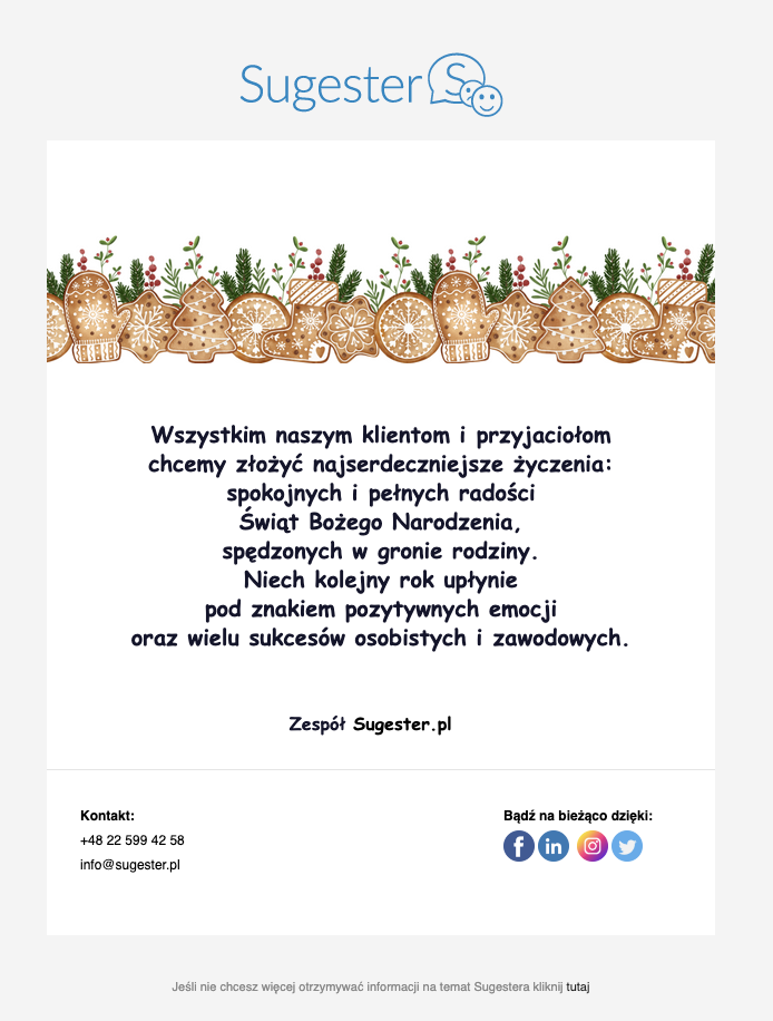
<div style="text-align: center;"><span style="font-family:Comic Sans MS,cursive; font-size: 20px;"><strong>Wszystkim naszym klientom i przyjaciołom<br />
chcemy złożyć najserdeczniejsze życzenia:<br />
spokojnych i pełnych radości<br />
Świąt Bożego Narodzenia,<br />
spędzonych w gronie rodziny.<br />
Niech kolejny rok upłynie<br />
pod znakiem pozytywnych emocji<br />
oraz wielu sukcesów osobistych i zawodowych.</strong></span></div>
</td>
</tr>
</tbody>
</table>
</td>
</tr>
<!-- Full Width, Fluid Column : END --><!-- Full Width, Fluid Column : BEGIN -->
<tr>
<td style="border-bottom: 1px solid #e5e5e5;">
<table align="center" border="0" cellpadding="0" cellspacing="0" width="100%">
<tbody>
<tr>
<td style="padding: 0px 30px 30px 30px; font-family: Comic Sans MS; font-size: 16px; line-height: 22px; color: #14142c;"><!-- Imageless Button : BEGIN --><!-- In Outlook, only the button label is clickable and nothing happens if you click the rest of the button shape. But it still works and code is simpler than the bulletproof button above. --><!-- Imageless Button : END -->
<div style="text-align: center;"><br />
<strong>Zespół <a href="http://{{company_website}}" style="text-decoration:none;color: #000" target="_blank">{{company_name}}</a> </strong> </div>
</td>
</tr>
</tbody>
</table>
</td>
</tr>
<!-- Full Width, Fluid Column : END --><!-- Three Column ==> Stacked Wide Layout ==> Stacked Narrow Layout : BEGIN -->
<tr>
<td style="padding: 30px;background-color:#ffffff">
<table border="0" cellpadding="0" cellspacing="0" class="columns-container">
<tbody>
<tr>
<td class="force-col" style="padding-right: 30px;font-family: sans-serif; font-size: 12px; line-height: 22px;color: #000000;" valign="top" width="160"><strong>Kontakt:</strong><br />
<span class="mobile_link">TU WPISZ NUMER TEL</span><br />
<a href="TU WPISZ ADRES EMAIL" style="color:#000000;font-weight:normal;text-decoration:none" target="_blank">TU WPISZ ADRES EMAIL</a><br />
</td>
<td class="hh-spacer" style="font-size: 0; line-height: 0; display: none;"> </td>
<td class="force-col" style="padding-right: 30px;font-family: sans-serif; font-size: 12px; line-height: 22px;color: #000000;" valign="top" width="160"><br />
</td>
<td class="hh-spacer" style="font-size: 0; line-height: 0; display: none;"> </td>
<td class="force-col" style="font-family: sans-serif; font-size: 12px; line-height: 22px;color: #000000;" valign="top" width="160"><strong style="display:block;margin-bottom:2px">Bądź na bieżąco dzięki:</strong> <a href="http://{{company_facebook}}" style="border:0;text-decoration:none" target="_blank"> <img alt="facebook" src="https://files1.intum.net/s/sugesret2/files/facebook%20%282%29%20%281%29.png" style="border:0;width:28px" /> </a> <a href="http://{{company_linkedin}}" style="border:0;text-decoration:none" target="_blank"> <img alt="linkedin" src="https://files1.intum.net/s/sugesret2/files/linkedin%20%282%29.png" style="border:0;width:28px" /> </a> <a href="http://{{company_instagram}}" style="border:0;text-decoration:none" target="_blank"> <img alt="instagaram" src="https://files1.intum.net/s/sugesret2/files/instagram%20%282%29%20%281%29.png" style="border:0;width:28px" /> </a> <a href="http://{{company_twitter}}" style="border:0;text-decoration:none" target="_blank"> <img alt="twitter" src="https://files1.intum.net/s/sugesret2/files/twitter%20%281%29.png" style="border:0;width:28px" /> </a></td>
</tr>
</tbody>
</table>
</td>
</tr>
<!-- Three Column ==> Stacked Wide Layout ==> Stacked Narrow Layout : END -->
</tbody>
</table>
<!-- Email Container : END --><!-- Footer : BEGIN -->
<table align="center" border="0" cellpadding="0" cellspacing="0" class="email-container" width="100%">
<tbody>
<tr>
<td style="text-align: center;padding: 20px;font-family: sans-serif; font-size: 11px; line-height: 18px;color: #888888;"><br />
Jeśli nie chcesz więcej otrzymywać od nas podobnych informacji kliknij <a href="[[unsubscribe_url]]">tutaj</a><br />
<br />
</td>
</tr>
</tbody>
</table>
<!-- Footer : END --></td>
</tr>
</tbody>
</table>
<!-- end of new new szablon -->
<div id="sugester_footer_end"> </div>
<div id="sugester_efooter_start"><br />
<br />
<br />
</div>
<div id="sugester_efooter_end"> </div>7.
Kod HTML do powyższego szablonu
<div id="sugester_footer_start"><br />
<!-- new new szablon --><meta http-equiv="Content-Type" content="text/html; charset=UTF-8"><meta name="viewport" content="initial-scale=1.0"><!-- So that mobile webkit will display zoomed in --><meta name="format-detection" content="telephone=no"><!-- disable auto telephone linking in iOS --></div>
<title></title>
<style type="text/css">a {
color: #236197;
text-decoration: none;
}
a:hover {
text-decoration: underline;
}
/* Force Hotmail to display emails at full width */
.ReadMsgBody {
width: 100%;
background-color: #ffffff;
}
/* Force Hotmail to display emails at full width */
.ExternalClass {
width: 100%;
background-color: #ffffff;
}
/* Forces Hotmail to display normal line spacing. */
.ExternalClass,
.ExternalClass p,
.ExternalClass span,
.ExternalClass font,
.ExternalClass td,
.ExternalClass div {
line-height:100%;
}
/* Resolves webkit padding issue. */
table {
border-spacing:0;
}
/* Resolves the Outlook 2007, 2010, and Gmail td padding issue. */
table td {
border-collapse:collapse;
}
/* Yahoo auto-sensing link color and border */
.yshortcuts a {
border-bottom: none !important;
}
h3 {
margin: 5px 0px 20px 0px; font-weight: normal; color: #236197; font-size: 17px;
}
.btn {
color: #000;
text-decoration: none;
display: inline-block;
padding: 9px 16px 8px 19px;
margin-bottom: 0;
text-align: center;
white-space: nowrap;
vertical-align: middle;
-ms-touch-action: manipulation;
touch-action: manipulation;
cursor: pointer;
-webkit-user-select: none;
-moz-user-select: none;
-ms-user-select: none;
user-select: none;
background-image: none;
border: 1px solid #184a76;
border-radius: 4px;
color: #fff;
background-color: #236197;
font-family: sans-serif;
font-size: 14px;
line-height: 2em;
margin-top:8px;
font-weight: 300;
}
.btn:hover,
.btn:focus {
color: #236197;
background-color: white;
border-color: #236197;
text-decoration: none;
}
h4 {margin-bottom: 0px;}
p {margin-top: 10px;}
span.more {
display: block;
clear: both;
margin-top: 10px;
}
span.no-break {
white-space: nowrap;
}
li {margin-left:10px;}
/* Media queries for when the viewport is smaller than the default email width but not too narrow. */
@media screen and (max-device-width: 650px), screen and (max-width: 650px) {
/* Constrain email width for small screens */
table[class="email-container"] {
width: 100% !important;
}
/* Constrain tables for small screens */
table[class="fluid"] {
width: 100% !important;
}
/* Force images to resize to full width of their container */
img[class="fluid"],
img[class="force-col-center"] {
width: 100% !important;
max-width: 100% !important;
height: auto !important;
}
/* And center these ones */
img[class="force-col-center"] {
margin: auto !important;
}
/* Force table cells into rows */
td[class="force-col"],
td[class="force-col-center"] {
display: block !important;
width: 100% !important;
clear: both;
}
/* And center these ones */
td[class="force-col-center"] {
text-align: center !important;
}
/* Force table cells into rows */
/* Float a previously stacked image to the left */
img[class="col-3-img-l"] {
float: left;
margin: 0 15px 15px 0;
}
/* Float a previously stacked image to the right */
img[class="col-3-img-r"] {
float: right;
margin: 0 0 15px 15px;
}
}
/* Media queries for when the viewport is narrow. */
/* Rules prefixed with 'hh-' (for 'handheld') repeat much of what's above, but these don't trigger until the smaller screen width. */
@media screen and (max-device-width: 425px), screen and (max-width: 425px) {
/* Helper only visible on handhelds. All styles are inline along with a `display:none`, which this class overrides */
div[class="hh-visible"] {
display: block !important;
}
/* Center stuff */
div[class="hh-center"] {
text-align: center;
width: 100% !important;
}
/* Constrain tables for small screens */
table[class="hh-fluid"] {
width: 100% !important;
}
/* Force images to resize to full width of their container */
img[class="hh-fluid"],
img[class="hh-force-col-center"] {
width: 100% !important;
max-width: 100% !important;
height: auto !important;
}
/* And center these ones */
img[class="hh-force-col-center"] {
margin: auto !important;
}
/* Force table cells into rows */
td[class="hh-force-col"],
td[class="hh-force-col-center"] {
display: block !important;
width: 100% !important;
clear: both;
}
/* And center these ones */
td[class="hh-force-col-center"] {
text-align: center !important;
}
/* Stack the previously floated images */
img[class="col-3-img-l"],
img[class="col-3-img-r"] {
float: none !important;
margin: 15px auto !important;
text-align: center !important;
}
table[class="button"] {
width: 100% !important;
text-align: center !important;
}
}
</style>
<table bgcolor="#f4f4f4" border="0" cellpadding="0" cellspacing="0" height="100%" style="background: #ffffff
;" width="100%">
<tbody>
<tr>
<td><!-- CSS Image background in Outlook : BEGIN --><!-- Best used with absolute image paths --><!--[if gte mso 9]>
<v:background xmlns:v="urn:schemas-microsoft-com:vml" fill="t">
<v:fill type="tile" color="#eeeeee" src="assets/nice_snow.png">
</v:background>
<![endif]--><!-- CSS Image background in Outlook : END --><!-- Logo Left Nav Right + Vertical Padding : BEGIN -->
<table align="center" border="0" cellpadding="0" cellspacing="0" class="email-container" width="600">
<tbody>
<tr>
<td colspan="2" height="30" style="font-size: 0; line-height: 0;"> </td>
</tr>
<tr>
<td class="force-col-center" style="padding: 15px 0;text-align: center;" valign="center"><a href="http://{{company_website}}" style="border:0;display:block;margin:5px 20px 0 0;" target="_blank"><img alt="logo" src="TU WKLEJ LINK DO LOGA Z PLIKÓW W SUGESTERZE" /> </a></td>
</tr>
</tbody>
</table>
<!-- Logo Left Nav Right + Vertical Padding : END --><!-- Email Container : BEGIN --><!-- This table wraps the whole body email within it's width (600px), sets the background color (white) and border (thin, gray, solid) -->
<table align="center" border="0" cellpadding="0" cellspacing="0" class="email-container" style="background: #f1f1ee;border: 0;" width="600"><!-- Full Width, Fluid Column : BEGIN --><!-- Single Fluid Image, No Crop : BEGIN -->
<tbody>
<tr>
<td><a href="https://{{company_website}}"><img alt="" border="0" class="fluid" height="" src="https://files1.intum.net/s/sugesret2/files/Ivory%20%26%20%20Gold%20Elegant%20Monimalist%20December%20Newsletter%20Winter%20Email%20Banner.png" style="display: block;" width="600" /> </a></td>
</tr>
<!-- Single Fluid Image, No Crop : END -->
<tr>
<td>
<table align="center" border="0" cellpadding="0" cellspacing="0" width="100%">
<tbody>
<tr>
<td style="padding: 30px; font-family: sans-serif; font-size: 14px; line-height: 22px; color: #14142c; font-size:13px;">
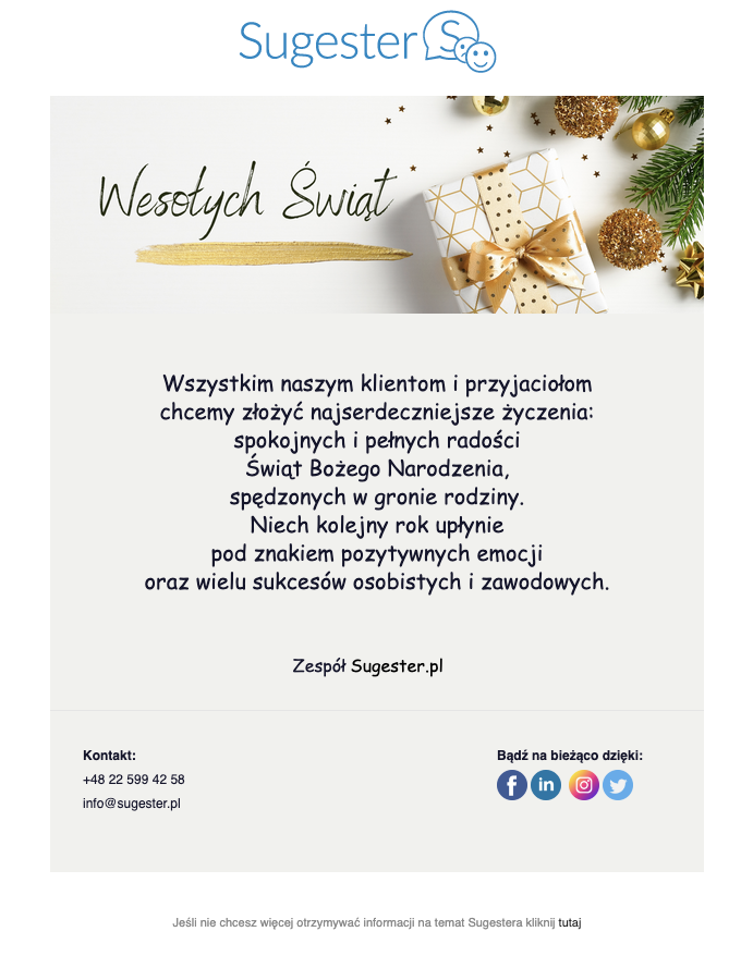
<div style="text-align: center;"><span style="font-family:Comic Sans MS,cursive; font-size: 20px;">Wszystkim naszym klientom i przyjaciołom<br />
chcemy złożyć najserdeczniejsze życzenia:<br />
spokojnych i pełnych radości<br />
Świąt Bożego Narodzenia,<br />
spędzonych w gronie rodziny.<br />
Niech kolejny rok upłynie<br />
pod znakiem pozytywnych emocji<br />
oraz wielu sukcesów osobistych i zawodowych.</span></div>
</td>
</tr>
</tbody>
</table>
</td>
</tr>
<!-- Full Width, Fluid Column : END --><!-- Full Width, Fluid Column : BEGIN -->
<tr>
<td style="border-bottom: 1px solid #e5e5e5;">
<table align="center" border="0" cellpadding="0" cellspacing="0" width="100%">
<tbody>
<tr>
<td style="padding: 0px 30px 30px 30px; font-family: Comic Sans MS; font-size: 16px; line-height: 22px; color: #14142c;"><!-- Imageless Button : BEGIN --><!-- In Outlook, only the button label is clickable and nothing happens if you click the rest of the button shape. But it still works and code is simpler than the bulletproof button above. --><!-- Imageless Button : END -->
<div style="text-align: center;"><br />
Zespół <a href="http://{{company_website}}" style="text-decoration:none;color: #000" target="_blank">{{company_name}}</a> <strong> </strong> </div>
</td>
</tr>
</tbody>
</table>
</td>
</tr>
<!-- Full Width, Fluid Column : END --><!-- Three Column ==> Stacked Wide Layout ==> Stacked Narrow Layout : BEGIN -->
<tr>
<td style="padding: 30px;background-color:#f1f1ee
">
<table border="0" cellpadding="0" cellspacing="0" class="columns-container">
<tbody>
<tr>
<td class="force-col" style="padding-right: 30px;font-family: sans-serif; font-size: 12px; line-height: 22px;color: #14142c;" valign="top" width="160"><strong>Kontakt:</strong><br />
<span class="mobile_link">TU WPISZ NUMER TEL</span><br />
<a href="TU WPISZ EMAIL" style="color:#14142c;font-weight:normal;text-decoration:none" target="_blank">TU WPISZ EMAIL</a><br />
</td>
<td class="hh-spacer" style="font-size: 0; line-height: 0; display: none;"> </td>
<td class="force-col" style="padding-right: 30px;font-family: sans-serif; font-size: 12px; line-height: 22px;color: #14142c;" valign="top" width="160"><br />
</td>
<td class="hh-spacer" style="font-size: 0; line-height: 0; display: none;"> </td>
<td class="force-col" style="font-family: sans-serif; font-size: 12px; line-height: 22px;color: #14142c;" valign="top" width="160"><strong style="display:block;margin-bottom:2px">Bądź na bieżąco dzięki:</strong> <a href="http://{{company_facebook}}" style="border:0;text-decoration:none" target="_blank"> <img alt="facebook" src="https://files1.intum.net/s/sugesret2/files/facebook%20%282%29%20%281%29.png" style="border:0;width:28px" /> </a> <a href="http://{{company_linkedin}}" style="border:0;text-decoration:none" target="_blank"> <img alt="linkedin" src="https://files1.intum.net/s/sugesret2/files/linkedin%20%284%29%20%281%29.png" style="border:0;width:28px" /> </a> <a href="http://{{company_instagram}}" style="border:0;text-decoration:none" target="_blank"> <img alt="instagaram" src="https://files1.intum.net/s/sugesret2/files/instagram%20%282%29%20%281%29.png" style="border:0;width:28px" /> </a> <a href="http://{{company_twitter}}" style="border:0;text-decoration:none" target="_blank"> <img alt="twitter" src="https://files1.intum.net/s/sugesret2/files/twitter%20%281%29.png" style="border:0;width:28px" /> </a></td>
</tr>
</tbody>
</table>
</td>
</tr>
<!-- Three Column ==> Stacked Wide Layout ==> Stacked Narrow Layout : END -->
</tbody>
</table>
<!-- Email Container : END --><!-- Footer : BEGIN -->
<table align="center" border="0" cellpadding="0" cellspacing="0" class="email-container" width="100%">
<tbody>
<tr>
<td style="text-align: center;padding: 20px;font-family: sans-serif; font-size: 11px; line-height: 18px;color: #888888;"><br />
Jeśli nie chcesz więcej otrzymywać od nas podobnych informacji kliknij <a href="[[unsubscribe_url]]">tutaj</a><br />
<br />
</td>
</tr>
</tbody>
</table>
<!-- Footer : END --></td>
</tr>
</tbody>
</table>
<!-- end of new new szablon -->
<div id="sugester_footer_end"> </div>
<div id="sugester_efooter_start"><br />
<br />
<br />
</div>
<div id="sugester_efooter_end"> </div>8.
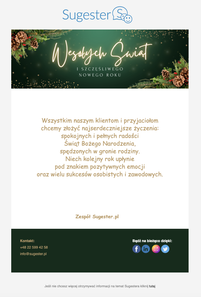
Kod HTML do powyższego szablonu
<div id="sugester_footer_start"><br />
<!-- new new szablon --><meta http-equiv="Content-Type" content="text/html; charset=UTF-8"><meta name="viewport" content="initial-scale=1.0"><!-- So that mobile webkit will display zoomed in --><meta name="format-detection" content="telephone=no"><!-- disable auto telephone linking in iOS --></div>
<title></title>
<style type="text/css">a {
color: #236197;
text-decoration: none;
}
a:hover {
text-decoration: underline;
}
/* Force Hotmail to display emails at full width */
.ReadMsgBody {
width: 100%;
background-color: #eeeeee;
}
/* Force Hotmail to display emails at full width */
.ExternalClass {
width: 100%;
background-color: #eeeeee;
}
/* Forces Hotmail to display normal line spacing. */
.ExternalClass,
.ExternalClass p,
.ExternalClass span,
.ExternalClass font,
.ExternalClass td,
.ExternalClass div {
line-height:100%;
}
/* Resolves webkit padding issue. */
table {
border-spacing:0;
}
/* Resolves the Outlook 2007, 2010, and Gmail td padding issue. */
table td {
border-collapse:collapse;
}
/* Yahoo auto-sensing link color and border */
.yshortcuts a {
border-bottom: none !important;
}
h3 {
margin: 5px 0px 20px 0px; font-weight: normal; color: #236197; font-size: 17px;
}
.btn {
color: #000;
text-decoration: none;
display: inline-block;
padding: 9px 16px 8px 19px;
margin-bottom: 0;
text-align: center;
white-space: nowrap;
vertical-align: middle;
-ms-touch-action: manipulation;
touch-action: manipulation;
cursor: pointer;
-webkit-user-select: none;
-moz-user-select: none;
-ms-user-select: none;
user-select: none;
background-image: none;
border: 1px solid #184a76;
border-radius: 4px;
color: #fff;
background-color: #236197;
font-family: sans-serif;
font-size: 14px;
line-height: 2em;
margin-top:8px;
font-weight: 300;
}
.btn:hover,
.btn:focus {
color: #236197;
background-color: white;
border-color: #236197;
text-decoration: none;
}
h4 {margin-bottom: 0px;}
p {margin-top: 10px;}
span.more {
display: block;
clear: both;
margin-top: 10px;
}
span.no-break {
white-space: nowrap;
}
li {margin-left:10px;}
/* Media queries for when the viewport is smaller than the default email width but not too narrow. */
@media screen and (max-device-width: 650px), screen and (max-width: 650px) {
/* Constrain email width for small screens */
table[class="email-container"] {
width: 100% !important;
}
/* Constrain tables for small screens */
table[class="fluid"] {
width: 100% !important;
}
/* Force images to resize to full width of their container */
img[class="fluid"],
img[class="force-col-center"] {
width: 100% !important;
max-width: 100% !important;
height: auto !important;
}
/* And center these ones */
img[class="force-col-center"] {
margin: auto !important;
}
/* Force table cells into rows */
td[class="force-col"],
td[class="force-col-center"] {
display: block !important;
width: 100% !important;
clear: both;
}
/* And center these ones */
td[class="force-col-center"] {
text-align: center !important;
}
/* Force table cells into rows */
/* Float a previously stacked image to the left */
img[class="col-3-img-l"] {
float: left;
margin: 0 15px 15px 0;
}
/* Float a previously stacked image to the right */
img[class="col-3-img-r"] {
float: right;
margin: 0 0 15px 15px;
}
}
/* Media queries for when the viewport is narrow. */
/* Rules prefixed with 'hh-' (for 'handheld') repeat much of what's above, but these don't trigger until the smaller screen width. */
@media screen and (max-device-width: 425px), screen and (max-width: 425px) {
/* Helper only visible on handhelds. All styles are inline along with a `display:none`, which this class overrides */
div[class="hh-visible"] {
display: block !important;
}
/* Center stuff */
div[class="hh-center"] {
text-align: center;
width: 100% !important;
}
/* Constrain tables for small screens */
table[class="hh-fluid"] {
width: 100% !important;
}
/* Force images to resize to full width of their container */
img[class="hh-fluid"],
img[class="hh-force-col-center"] {
width: 100% !important;
max-width: 100% !important;
height: auto !important;
}
/* And center these ones */
img[class="hh-force-col-center"] {
margin: auto !important;
}
/* Force table cells into rows */
td[class="hh-force-col"],
td[class="hh-force-col-center"] {
display: block !important;
width: 100% !important;
clear: both;
}
/* And center these ones */
td[class="hh-force-col-center"] {
text-align: center !important;
}
/* Stack the previously floated images */
img[class="col-3-img-l"],
img[class="col-3-img-r"] {
float: none !important;
margin: 15px auto !important;
text-align: center !important;
}
table[class="button"] {
width: 100% !important;
text-align: center !important;
}
}
</style>
<table bgcolor="#f4f4f4" border="0" cellpadding="0" cellspacing="0" height="100%" style="background: #f4f4f4;" width="100%">
<tbody>
<tr>
<td><!-- CSS Image background in Outlook : BEGIN --><!-- Best used with absolute image paths --><!--[if gte mso 9]>
<v:background xmlns:v="urn:schemas-microsoft-com:vml" fill="t">
<v:fill type="tile" color="#eeeeee" src="assets/nice_snow.png">
</v:background>
<![endif]--><!-- CSS Image background in Outlook : END --><!-- Logo Left Nav Right + Vertical Padding : BEGIN -->
<table align="center" border="0" cellpadding="0" cellspacing="0" class="email-container" width="600">
<tbody>
<tr>
<td colspan="2" height="30" style="font-size: 0; line-height: 0;"> </td>
</tr>
<tr>
<td class="force-col-center" style="padding: 15px 0;text-align: center;" valign="center"><a href="http://{{company_website}}" style="border:0;display:block;margin:5px 20px 0 0;" target="_blank"><img alt="logo" src="TU WKLEJ LINK DO LOGA Z PLIKÓW W SUGESTERZE" /> </a></td>
</tr>
</tbody>
</table>
<!-- Logo Left Nav Right + Vertical Padding : END --><!-- Email Container : BEGIN --><!-- This table wraps the whole body email within it's width (600px), sets the background color (white) and border (thin, gray, solid) -->
<table align="center" border="0" cellpadding="0" cellspacing="0" class="email-container" style="background: #ffffff;border: 0;" width="600"><!-- Full Width, Fluid Column : BEGIN --><!-- Single Fluid Image, No Crop : BEGIN -->
<tbody>
<tr>
<td><a href="https://{{company_website}}"><img alt="" border="0" class="fluid" height="" src="https://files1.intum.net/s/sugesret2/files/Green%20Modern%20Merry%20Christmas%20And%20Happy%20New%20Year%20Twitter%20Header.png" style="display: block;" width="600" /> </a></td>
</tr>
<!-- Single Fluid Image, No Crop : END -->
<tr>
<td>
<table align="center" border="0" cellpadding="0" cellspacing="0" width="100%">
<tbody>
<tr>
<td style="padding: 30px; font-family: sans-serif; font-size: 14px; line-height: 22px; color: #be9e69; font-size:13px;">
<div style="text-align: center;"><span style="font-family:Comic Sans MS,cursive;"><span style="font-size: 20px;">Wszystkim naszym klientom i przyjaciołom<br />
chcemy złożyć najserdeczniejsze życzenia:<br />
spokojnych i pełnych radości<br />
Świąt Bożego Narodzenia,</span></span><br />
<span style="font-family:Comic Sans MS,cursive; font-size: 20px;">spędzonych w gronie rodziny.<br />
Niech kolejny rok upłynie<br />
pod znakiem pozytywnych emocji<br />
oraz wielu sukcesów osobistych i zawodowych.</span></div>
</td>
</tr>
</tbody>
</table>
</td>
</tr>
<!-- Full Width, Fluid Column : END --><!-- Full Width, Fluid Column : BEGIN -->
<tr>
<td style="border-bottom: 1px solid #e5e5e5;">
<table align="center" border="0" cellpadding="0" cellspacing="0" width="100%">
<tbody>
<tr>
<td style="padding: 0px 30px 30px 30px; font-family: Comic Sans MS; font-size: 16px; line-height: 22px; color: #be9e69;"><!-- Imageless Button : BEGIN --><!-- In Outlook, only the button label is clickable and nothing happens if you click the rest of the button shape. But it still works and code is simpler than the bulletproof button above. --><!-- Imageless Button : END -->
<div style="text-align: center;"><br />
<strong>Zespół <a href="http://{{company_website}}" style="text-decoration:none;color: #be9e69" target="_blank">{{company_name}}</a> </strong> </div>
</td>
</tr>
</tbody>
</table>
</td>
</tr>
<!-- Full Width, Fluid Column : END --><!-- Three Column ==> Stacked Wide Layout ==> Stacked Narrow Layout : BEGIN -->
<tr>
<td style="padding: 30px;background-color:#0f2c1a">
<table border="0" cellpadding="0" cellspacing="0" class="columns-container">
<tbody>
<tr>
<td class="force-col" style="padding-right: 30px;font-family: sans-serif; font-size: 12px; line-height: 22px;color: #be9e69;" valign="top" width="160"><strong>Kontakt:</strong><br />
<span class="mobile_link">TU WPISZ NUMER TEL</span><br />
<a href="TU WPISZ EMAIL" style="color:#be9e69;font-weight:normal;text-decoration:none" target="_blank">TU WPISZ EMAIL</a><br />
</td>
<td class="hh-spacer" style="font-size: 0; line-height: 0; display: none;"> </td>
<td class="force-col" style="padding-right: 30px;font-family: sans-serif; font-size: 12px; line-height: 22px;color: #ffffff;" valign="top" width="160"><br />
</td>
<td class="hh-spacer" style="font-size: 0; line-height: 0; display: none;"> </td>
<td class="force-col" style="font-family: sans-serif; font-size: 12px; line-height: 22px;color: #ffffff;" valign="top" width="160"><strong style="display:block;margin-bottom:2px">Bądź na bieżąco dzięki:</strong> <a href="http://{{company_facebook}}" style="border:0;text-decoration:none" target="_blank"> <img alt="facebook" src="https://files1.intum.net/s/sugesret2/files/facebook%20%282%29%20%281%29.png" style="border:0;width:28px" /> </a> <a href="http://{{company_linkedin}}" style="border:0;text-decoration:none" target="_blank"> <img alt="linkedin" src="https://files1.intum.net/s/sugesret2/files/linkedin%20%284%29%20%281%29.png" style="border:0;width:28px" /> </a> <a href="http://{{company_instagram}}" style="border:0;text-decoration:none" target="_blank"> <img alt="instagaram" src="https://files1.intum.net/s/sugesret2/files/instagram%20%282%29%20%281%29.png" style="border:0;width:28px" /> </a> <a href="http://{{company_twitter}}" style="border:0;text-decoration:none" target="_blank"> <img alt="twitter" src="https://files1.intum.net/s/sugesret2/files/twitter%20%281%29.png" style="border:0;width:28px" /> </a></td>
</tr>
</tbody>
</table>
</td>
</tr>
<!-- Three Column ==> Stacked Wide Layout ==> Stacked Narrow Layout : END -->
</tbody>
</table>
<!-- Email Container : END --><!-- Footer : BEGIN -->
<table align="center" border="0" cellpadding="0" cellspacing="0" class="email-container" width="100%">
<tbody>
<tr>
<td style="text-align: center;padding: 20px;font-family: sans-serif; font-size: 11px; line-height: 18px;color: #888888;"><br />
Jeśli nie chcesz więcej otrzymywać od nas podobnych informacji kliknij <a href="[[unsubscribe_url]]">tutaj</a><br />
<br />
</td>
</tr>
</tbody>
</table>
<!-- Footer : END --></td>
</tr>
</tbody>
</table>
<!-- end of new new szablon -->
<div id="sugester_footer_end"> </div>
<div id="sugester_efooter_start"><br />
<br />
</div>
<div id="sugester_efooter_end"> </div>9.
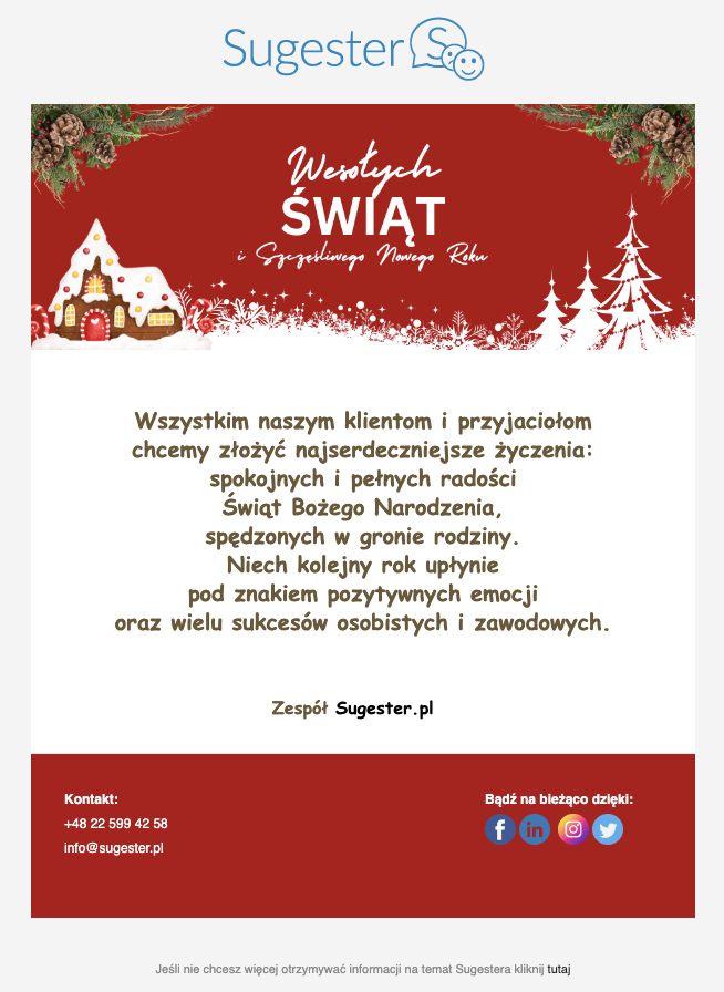
Kod HTML do powyższego szablonu
<div id="sugester_footer_start"><br />
<!-- new new szablon --><meta http-equiv="Content-Type" content="text/html; charset=UTF-8"><meta name="viewport" content="initial-scale=1.0"><!-- So that mobile webkit will display zoomed in --><meta name="format-detection" content="telephone=no"><!-- disable auto telephone linking in iOS --></div>
<title></title>
<style type="text/css">a {
color: #236197;
text-decoration: none;
}
a:hover {
text-decoration: underline;
}
/* Force Hotmail to display emails at full width */
.ReadMsgBody {
width: 100%;
background-color: #eeeeee;
}
/* Force Hotmail to display emails at full width */
.ExternalClass {
width: 100%;
background-color: #eeeeee;
}
/* Forces Hotmail to display normal line spacing. */
.ExternalClass,
.ExternalClass p,
.ExternalClass span,
.ExternalClass font,
.ExternalClass td,
.ExternalClass div {
line-height:100%;
}
/* Resolves webkit padding issue. */
table {
border-spacing:0;
}
/* Resolves the Outlook 2007, 2010, and Gmail td padding issue. */
table td {
border-collapse:collapse;
}
/* Yahoo auto-sensing link color and border */
.yshortcuts a {
border-bottom: none !important;
}
h3 {
margin: 5px 0px 20px 0px; font-weight: normal; color: #236197; font-size: 17px;
}
.btn {
color: #000;
text-decoration: none;
display: inline-block;
padding: 9px 16px 8px 19px;
margin-bottom: 0;
text-align: center;
white-space: nowrap;
vertical-align: middle;
-ms-touch-action: manipulation;
touch-action: manipulation;
cursor: pointer;
-webkit-user-select: none;
-moz-user-select: none;
-ms-user-select: none;
user-select: none;
background-image: none;
border: 1px solid #184a76;
border-radius: 4px;
color: #fff;
background-color: #236197;
font-family: sans-serif;
font-size: 14px;
line-height: 2em;
margin-top:8px;
font-weight: 300;
}
.btn:hover,
.btn:focus {
color: #236197;
background-color: white;
border-color: #236197;
text-decoration: none;
}
h4 {margin-bottom: 0px;}
p {margin-top: 10px;}
span.more {
display: block;
clear: both;
margin-top: 10px;
}
span.no-break {
white-space: nowrap;
}
li {margin-left:10px;}
/* Media queries for when the viewport is smaller than the default email width but not too narrow. */
@media screen and (max-device-width: 650px), screen and (max-width: 650px) {
/* Constrain email width for small screens */
table[class="email-container"] {
width: 100% !important;
}
/* Constrain tables for small screens */
table[class="fluid"] {
width: 100% !important;
}
/* Force images to resize to full width of their container */
img[class="fluid"],
img[class="force-col-center"] {
width: 100% !important;
max-width: 100% !important;
height: auto !important;
}
/* And center these ones */
img[class="force-col-center"] {
margin: auto !important;
}
/* Force table cells into rows */
td[class="force-col"],
td[class="force-col-center"] {
display: block !important;
width: 100% !important;
clear: both;
}
/* And center these ones */
td[class="force-col-center"] {
text-align: center !important;
}
/* Force table cells into rows */
/* Float a previously stacked image to the left */
img[class="col-3-img-l"] {
float: left;
margin: 0 15px 15px 0;
}
/* Float a previously stacked image to the right */
img[class="col-3-img-r"] {
float: right;
margin: 0 0 15px 15px;
}
}
/* Media queries for when the viewport is narrow. */
/* Rules prefixed with 'hh-' (for 'handheld') repeat much of what's above, but these don't trigger until the smaller screen width. */
@media screen and (max-device-width: 425px), screen and (max-width: 425px) {
/* Helper only visible on handhelds. All styles are inline along with a `display:none`, which this class overrides */
div[class="hh-visible"] {
display: block !important;
}
/* Center stuff */
div[class="hh-center"] {
text-align: center;
width: 100% !important;
}
/* Constrain tables for small screens */
table[class="hh-fluid"] {
width: 100% !important;
}
/* Force images to resize to full width of their container */
img[class="hh-fluid"],
img[class="hh-force-col-center"] {
width: 100% !important;
max-width: 100% !important;
height: auto !important;
}
/* And center these ones */
img[class="hh-force-col-center"] {
margin: auto !important;
}
/* Force table cells into rows */
td[class="hh-force-col"],
td[class="hh-force-col-center"] {
display: block !important;
width: 100% !important;
clear: both;
}
/* And center these ones */
td[class="hh-force-col-center"] {
text-align: center !important;
}
/* Stack the previously floated images */
img[class="col-3-img-l"],
img[class="col-3-img-r"] {
float: none !important;
margin: 15px auto !important;
text-align: center !important;
}
table[class="button"] {
width: 100% !important;
text-align: center !important;
}
}
</style>
<table bgcolor="#f4f4f4" border="0" cellpadding="0" cellspacing="0" height="100%" style="background: #f4f4f4;" width="100%">
<tbody>
<tr>
<td><!-- CSS Image background in Outlook : BEGIN --><!-- Best used with absolute image paths --><!--[if gte mso 9]>
<v:background xmlns:v="urn:schemas-microsoft-com:vml" fill="t">
<v:fill type="tile" color="#eeeeee" src="assets/nice_snow.png">
</v:background>
<![endif]--><!-- CSS Image background in Outlook : END --><!-- Logo Left Nav Right + Vertical Padding : BEGIN -->
<table align="center" border="0" cellpadding="0" cellspacing="0" class="email-container" width="600">
<tbody>
<tr>
<td colspan="2" height="30" style="font-size: 0; line-height: 0;"> </td>
</tr>
<tr>
<td class="force-col-center" style="padding: 15px 0;text-align: center;" valign="center"><a href="http://{{company_website}}" style="border:0;display:block;margin:5px 20px 0 0;" target="_blank"><img alt="logo" src="TU WKLEJ LINK DO LOGA Z PLIKÓW W SUGESTERZE" /> </a></td>
</tr>
</tbody>
</table>
<!-- Logo Left Nav Right + Vertical Padding : END --><!-- Email Container : BEGIN --><!-- This table wraps the whole body email within it's width (600px), sets the background color (white) and border (thin, gray, solid) -->
<table align="center" border="0" cellpadding="0" cellspacing="0" class="email-container" style="background: #ffffff;border: 0;" width="600"><!-- Full Width, Fluid Column : BEGIN --><!-- Single Fluid Image, No Crop : BEGIN -->
<tbody>
<tr>
<td><a href="https://{{company_website}}"><img alt="" border="0" class="fluid" height="" src="https://files1.intum.net/s/sugesret2/files/Red%20White%20Minimalist%20Merry%20Christmas%20cover%20photo.png" style="display: block;" width="600" /> </a></td>
</tr>
<!-- Single Fluid Image, No Crop : END -->
<tr>
<td>
<table align="center" border="0" cellpadding="0" cellspacing="0" width="100%">
<tbody>
<tr>
<td style="padding: 30px; font-family: sans-serif; font-size: 14px; line-height: 22px; color: #6c5935
; font-size:13px;">
<div style="text-align: center;"><span style="font-family:Comic Sans MS,cursive; font-size: 20px;"><strong>Wszystkim naszym klientom i przyjaciołom<br />
chcemy złożyć najserdeczniejsze życzenia:<br />
spokojnych i pełnych radości<br />
Świąt Bożego Narodzenia,<br />
spędzonych w gronie rodziny.<br />
Niech kolejny rok upłynie<br />
pod znakiem pozytywnych emocji<br />
oraz wielu sukcesów osobistych i zawodowych.</strong></span></div>
</td>
</tr>
</tbody>
</table>
</td>
</tr>
<!-- Full Width, Fluid Column : END --><!-- Full Width, Fluid Column : BEGIN -->
<tr>
<td style="border-bottom: 1px solid #e5e5e5;">
<table align="center" border="0" cellpadding="0" cellspacing="0" width="100%">
<tbody>
<tr>
<td style="padding: 0px 30px 30px 30px; font-family: Comic Sans MS; font-size: 16px; line-height: 22px; color: #6c5935;"><!-- Imageless Button : BEGIN --><!-- In Outlook, only the button label is clickable and nothing happens if you click the rest of the button shape. But it still works and code is simpler than the bulletproof button above. --><!-- Imageless Button : END -->
<div style="text-align: center;"><br />
<strong>Zespół <a href="http://{{company_website}}" style="text-decoration:none;color: #6c5935" target="_blank">{{company_name}}</a> </strong> </div>
</td>
</tr>
</tbody>
</table>
</td>
</tr>
<!-- Full Width, Fluid Column : END --><!-- Three Column ==> Stacked Wide Layout ==> Stacked Narrow Layout : BEGIN -->
<tr>
<td style="padding: 30px;background-color:#b30d14">
<table border="0" cellpadding="0" cellspacing="0" class="columns-container">
<tbody>
<tr>
<td class="force-col" style="padding-right: 30px;font-family: sans-serif; font-size: 12px; line-height: 22px;color: #ffffff;" valign="top" width="160"><strong>Kontakt:</strong><br />
<span class="mobile_link">TU WPISZ NUMER TEL</span><br />
<a href="TU WPISZ EMAIL" style="color:#ffffff;font-weight:normal;text-decoration:none" target="_blank">TU WPISZ EMAIL</a><br />
</td>
<td class="hh-spacer" style="font-size: 0; line-height: 0; display: none;"> </td>
<td class="force-col" style="padding-right: 30px;font-family: sans-serif; font-size: 12px; line-height: 22px;color: #ffffff;" valign="top" width="160"><br />
</td>
<td class="hh-spacer" style="font-size: 0; line-height: 0; display: none;"> </td>
<td class="force-col" style="font-family: sans-serif; font-size: 12px; line-height: 22px;color: #ffffff;" valign="top" width="160"><strong style="display:block;margin-bottom:2px">Bądź na bieżąco dzięki:</strong> <a href="http://{{company_facebook}}" style="border:0;text-decoration:none" target="_blank"> <img alt="facebook" src="https://files1.intum.net/s/sugesret2/files/facebook%20%282%29%20%281%29.png" style="border:0;width:28px" /> </a> <a href="http://{{company_linkedin}}" style="border:0;text-decoration:none" target="_blank"> <img alt="linkedin" src="https://files1.intum.net/s/sugesret2/files/linkedin%20%284%29%20%281%29.png" style="border:0;width:28px" /> </a> <a href="http://{{company_instagram}}" style="border:0;text-decoration:none" target="_blank"> <img alt="instagaram" src="https://files1.intum.net/s/sugesret2/files/instagram%20%282%29%20%281%29.png" style="border:0;width:28px" /> </a> <a href="http://{{company_twitter}}" style="border:0;text-decoration:none" target="_blank"> <img alt="twitter" src="https://files1.intum.net/s/sugesret2/files/twitter%20%281%29.png" style="border:0;width:28px" /> </a></td>
</tr>
</tbody>
</table>
</td>
</tr>
<!-- Three Column ==> Stacked Wide Layout ==> Stacked Narrow Layout : END -->
</tbody>
</table>
<!-- Email Container : END --><!-- Footer : BEGIN -->
<table align="center" border="0" cellpadding="0" cellspacing="0" class="email-container" width="100%">
<tbody>
<tr>
<td style="text-align: center;padding: 20px;font-family: sans-serif; font-size: 11px; line-height: 18px;color: #888888;"><br />
Jeśli nie chcesz więcej otrzymywać od nas podobnych informacji kliknij <a href="[[unsubscribe_url]]">tutaj</a><br />
<br />
</td>
</tr>
</tbody>
</table>
<!-- Footer : END --></td>
</tr>
</tbody>
</table>
<!-- end of new new szablon -->
<div id="sugester_footer_end"> </div>
<div id="sugester_efooter_start"><br />
<br />
<br />
</div>
<div id="sugester_efooter_end"> </div>10.
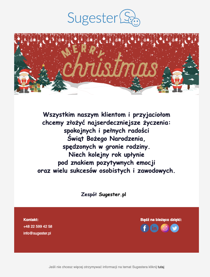
Kod HTML do powyższego szablonu
<div id="sugester_footer_start"><br />
<!-- new new szablon --><meta http-equiv="Content-Type" content="text/html; charset=UTF-8"><meta name="viewport" content="initial-scale=1.0"><!-- So that mobile webkit will display zoomed in --><meta name="format-detection" content="telephone=no"><!-- disable auto telephone linking in iOS --></div>
<title></title>
<style type="text/css">a {
color: #236197;
text-decoration: none;
}
a:hover {
text-decoration: underline;
}
/* Force Hotmail to display emails at full width */
.ReadMsgBody {
width: 100%;
background-color: #eeeeee;
}
/* Force Hotmail to display emails at full width */
.ExternalClass {
width: 100%;
background-color: #eeeeee;
}
/* Forces Hotmail to display normal line spacing. */
.ExternalClass,
.ExternalClass p,
.ExternalClass span,
.ExternalClass font,
.ExternalClass td,
.ExternalClass div {
line-height:100%;
}
/* Resolves webkit padding issue. */
table {
border-spacing:0;
}
/* Resolves the Outlook 2007, 2010, and Gmail td padding issue. */
table td {
border-collapse:collapse;
}
/* Yahoo auto-sensing link color and border */
.yshortcuts a {
border-bottom: none !important;
}
h3 {
margin: 5px 0px 20px 0px; font-weight: normal; color: #236197; font-size: 17px;
}
.btn {
color: #000;
text-decoration: none;
display: inline-block;
padding: 9px 16px 8px 19px;
margin-bottom: 0;
text-align: center;
white-space: nowrap;
vertical-align: middle;
-ms-touch-action: manipulation;
touch-action: manipulation;
cursor: pointer;
-webkit-user-select: none;
-moz-user-select: none;
-ms-user-select: none;
user-select: none;
background-image: none;
border: 1px solid #184a76;
border-radius: 4px;
color: #fff;
background-color: #236197;
font-family: sans-serif;
font-size: 14px;
line-height: 2em;
margin-top:8px;
font-weight: 300;
}
.btn:hover,
.btn:focus {
color: #236197;
background-color: white;
border-color: #236197;
text-decoration: none;
}
h4 {margin-bottom: 0px;}
p {margin-top: 10px;}
span.more {
display: block;
clear: both;
margin-top: 10px;
}
span.no-break {
white-space: nowrap;
}
li {margin-left:10px;}
/* Media queries for when the viewport is smaller than the default email width but not too narrow. */
@media screen and (max-device-width: 650px), screen and (max-width: 650px) {
/* Constrain email width for small screens */
table[class="email-container"] {
width: 100% !important;
}
/* Constrain tables for small screens */
table[class="fluid"] {
width: 100% !important;
}
/* Force images to resize to full width of their container */
img[class="fluid"],
img[class="force-col-center"] {
width: 100% !important;
max-width: 100% !important;
height: auto !important;
}
/* And center these ones */
img[class="force-col-center"] {
margin: auto !important;
}
/* Force table cells into rows */
td[class="force-col"],
td[class="force-col-center"] {
display: block !important;
width: 100% !important;
clear: both;
}
/* And center these ones */
td[class="force-col-center"] {
text-align: center !important;
}
/* Force table cells into rows */
/* Float a previously stacked image to the left */
img[class="col-3-img-l"] {
float: left;
margin: 0 15px 15px 0;
}
/* Float a previously stacked image to the right */
img[class="col-3-img-r"] {
float: right;
margin: 0 0 15px 15px;
}
}
/* Media queries for when the viewport is narrow. */
/* Rules prefixed with 'hh-' (for 'handheld') repeat much of what's above, but these don't trigger until the smaller screen width. */
@media screen and (max-device-width: 425px), screen and (max-width: 425px) {
/* Helper only visible on handhelds. All styles are inline along with a `display:none`, which this class overrides */
div[class="hh-visible"] {
display: block !important;
}
/* Center stuff */
div[class="hh-center"] {
text-align: center;
width: 100% !important;
}
/* Constrain tables for small screens */
table[class="hh-fluid"] {
width: 100% !important;
}
/* Force images to resize to full width of their container */
img[class="hh-fluid"],
img[class="hh-force-col-center"] {
width: 100% !important;
max-width: 100% !important;
height: auto !important;
}
/* And center these ones */
img[class="hh-force-col-center"] {
margin: auto !important;
}
/* Force table cells into rows */
td[class="hh-force-col"],
td[class="hh-force-col-center"] {
display: block !important;
width: 100% !important;
clear: both;
}
/* And center these ones */
td[class="hh-force-col-center"] {
text-align: center !important;
}
/* Stack the previously floated images */
img[class="col-3-img-l"],
img[class="col-3-img-r"] {
float: none !important;
margin: 15px auto !important;
text-align: center !important;
}
table[class="button"] {
width: 100% !important;
text-align: center !important;
}
}
</style>
<table bgcolor="#f4f4f4" border="0" cellpadding="0" cellspacing="0" height="100%" style="background: #f4f4f4;" width="100%">
<tbody>
<tr>
<td><!-- CSS Image background in Outlook : BEGIN --><!-- Best used with absolute image paths --><!--[if gte mso 9]>
<v:background xmlns:v="urn:schemas-microsoft-com:vml" fill="t">
<v:fill type="tile" color="#eeeeee" src="assets/nice_snow.png">
</v:background>
<![endif]--><!-- CSS Image background in Outlook : END --><!-- Logo Left Nav Right + Vertical Padding : BEGIN -->
<table align="center" border="0" cellpadding="0" cellspacing="0" class="email-container" width="600">
<tbody>
<tr>
<td colspan="2" height="30" style="font-size: 0; line-height: 0;"> </td>
</tr>
<tr>
<td class="force-col-center" style="padding: 15px 0;text-align: center;" valign="center"><a href="http://{{company_website}}" style="border:0;display:block;margin:5px 20px 0 0;" target="_blank"><img alt="logo" src="TU WKLEJ LINK DO LOGA Z PLIKÓW W SUGESTERZE" /> </a></td>
</tr>
</tbody>
</table>
<!-- Logo Left Nav Right + Vertical Padding : END --><!-- Email Container : BEGIN --><!-- This table wraps the whole body email within it's width (600px), sets the background color (white) and border (thin, gray, solid) -->
<table align="center" border="0" cellpadding="0" cellspacing="0" class="email-container" style="background: #ffffff;border: 0;" width="600"><!-- Full Width, Fluid Column : BEGIN --><!-- Single Fluid Image, No Crop : BEGIN -->
<tbody>
<tr>
<td><a href="https://{{company_website}}"><img alt="" border="0" class="fluid" height="" src="https://files1.intum.net/s/sugesret2/files/Red%20White%20And%20Green%20Modern%20Merry.png" style="display: block;" width="600" /> </a></td>
</tr>
<!-- Single Fluid Image, No Crop : END -->
<tr>
<td>
<table align="center" border="0" cellpadding="0" cellspacing="0" width="100%">
<tbody>
<tr>
<td style="padding: 30px; font-family: sans-serif; font-size: 14px; line-height: 22px; color: #14142c; font-size:13px;">
<div style="text-align: center;"><span style="font-family:Comic Sans MS,cursive; font-size: 20px;"><strong>Wszystkim naszym klientom i przyjaciołom<br />
chcemy złożyć najserdeczniejsze życzenia:<br />
spokojnych i pełnych radości<br />
Świąt Bożego Narodzenia,<br />
spędzonych w gronie rodziny.<br />
Niech kolejny rok upłynie<br />
pod znakiem pozytywnych emocji<br />
oraz wielu sukcesów osobistych i zawodowych.</strong></span></div>
</td>
</tr>
</tbody>
</table>
</td>
</tr>
<!-- Full Width, Fluid Column : END --><!-- Full Width, Fluid Column : BEGIN -->
<tr>
<td style="border-bottom: 1px solid #e5e5e5;">
<table align="center" border="0" cellpadding="0" cellspacing="0" width="100%">
<tbody>
<tr>
<td style="padding: 0px 30px 30px 30px; font-family: Comic Sans MS; font-size: 16px; line-height: 22px; color: #14142c;"><!-- Imageless Button : BEGIN --><!-- In Outlook, only the button label is clickable and nothing happens if you click the rest of the button shape. But it still works and code is simpler than the bulletproof button above. --><!-- Imageless Button : END -->
<div style="text-align: center;"><br />
<strong>Zespół <a href="http://{{company_website}}" style="text-decoration:none;color: #000" target="_blank">{{company_name}}</a> </strong> </div>
</td>
</tr>
</tbody>
</table>
</td>
</tr>
<!-- Full Width, Fluid Column : END --><!-- Three Column ==> Stacked Wide Layout ==> Stacked Narrow Layout : BEGIN -->
<tr>
<td style="padding: 30px;background-color:#b42424">
<table border="0" cellpadding="0" cellspacing="0" class="columns-container">
<tbody>
<tr>
<td class="force-col" style="padding-right: 30px;font-family: sans-serif; font-size: 12px; line-height: 22px;color: #ffffff;" valign="top" width="160"><strong>Kontakt:</strong><br />
<span class="mobile_link">TU WPISZ NUMER TEL</span><br />
<a href="TU WPISZ EMAIL" style="color:#ffffff;font-weight:normal;text-decoration:none" target="_blank">TU WPISZ EMAIL</a><br />
</td>
<td class="hh-spacer" style="font-size: 0; line-height: 0; display: none;"> </td>
<td class="force-col" style="padding-right: 30px;font-family: sans-serif; font-size: 12px; line-height: 22px;color: #ffffff;" valign="top" width="160"><br />
</td>
<td class="hh-spacer" style="font-size: 0; line-height: 0; display: none;"> </td>
<td class="force-col" style="font-family: sans-serif; font-size: 12px; line-height: 22px;color: #ffffff;" valign="top" width="160"><strong style="display:block;margin-bottom:2px">Bądź na bieżąco dzięki:</strong> <a href="http://{{company_facebook}}" style="border:0;text-decoration:none" target="_blank"> <img alt="facebook" src="https://files1.intum.net/s/sugesret2/files/facebook%20%282%29%20%281%29.png" style="border:0;width:28px" /> </a> <a href="http://{{company_linkedin}}" style="border:0;text-decoration:none" target="_blank"> <img alt="linkedin" src="https://files1.intum.net/s/sugesret2/files/linkedin%20%284%29%20%281%29.png" style="border:0;width:28px" /> </a> <a href="http://{{company_instagram}}" style="border:0;text-decoration:none" target="_blank"> <img alt="instagaram" src="https://files1.intum.net/s/sugesret2/files/instagram%20%282%29%20%281%29.png" style="border:0;width:28px" /> </a> <a href="http://{{company_twitter}}" style="border:0;text-decoration:none" target="_blank"> <img alt="twitter" src="https://files1.intum.net/s/sugesret2/files/twitter%20%281%29.png" style="border:0;width:28px" /> </a></td>
</tr>
</tbody>
</table>
</td>
</tr>
<!-- Three Column ==> Stacked Wide Layout ==> Stacked Narrow Layout : END -->
</tbody>
</table>
<!-- Email Container : END --><!-- Footer : BEGIN -->
<table align="center" border="0" cellpadding="0" cellspacing="0" class="email-container" width="100%">
<tbody>
<tr>
<td style="text-align: center;padding: 20px;font-family: sans-serif; font-size: 11px; line-height: 18px;color: #888888;"><br />
Jeśli nie chcesz więcej otrzymywać od nas podobnych informacji kliknij <a href="[[unsubscribe_url]]">tutaj</a><br />
<br />
</td>
</tr>
</tbody>
</table>
<!-- Footer : END --></td>
</tr>
</tbody>
</table>
<!-- end of new new szablon -->
<div id="sugester_footer_end"> </div>
<div id="sugester_efooter_start"><br />
<br />
<br />
</div>
<div id="sugester_efooter_end"> </div>